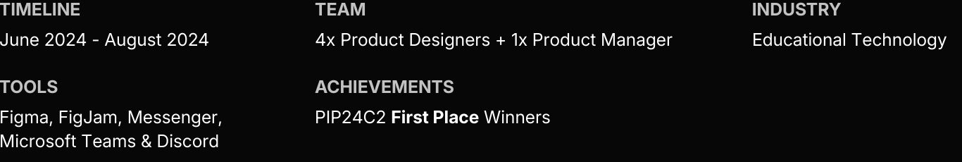
Overview
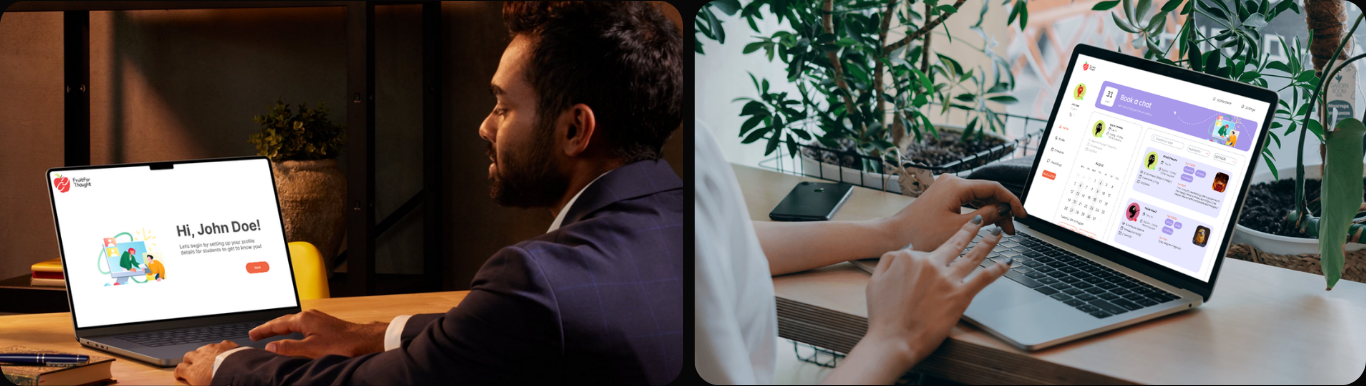
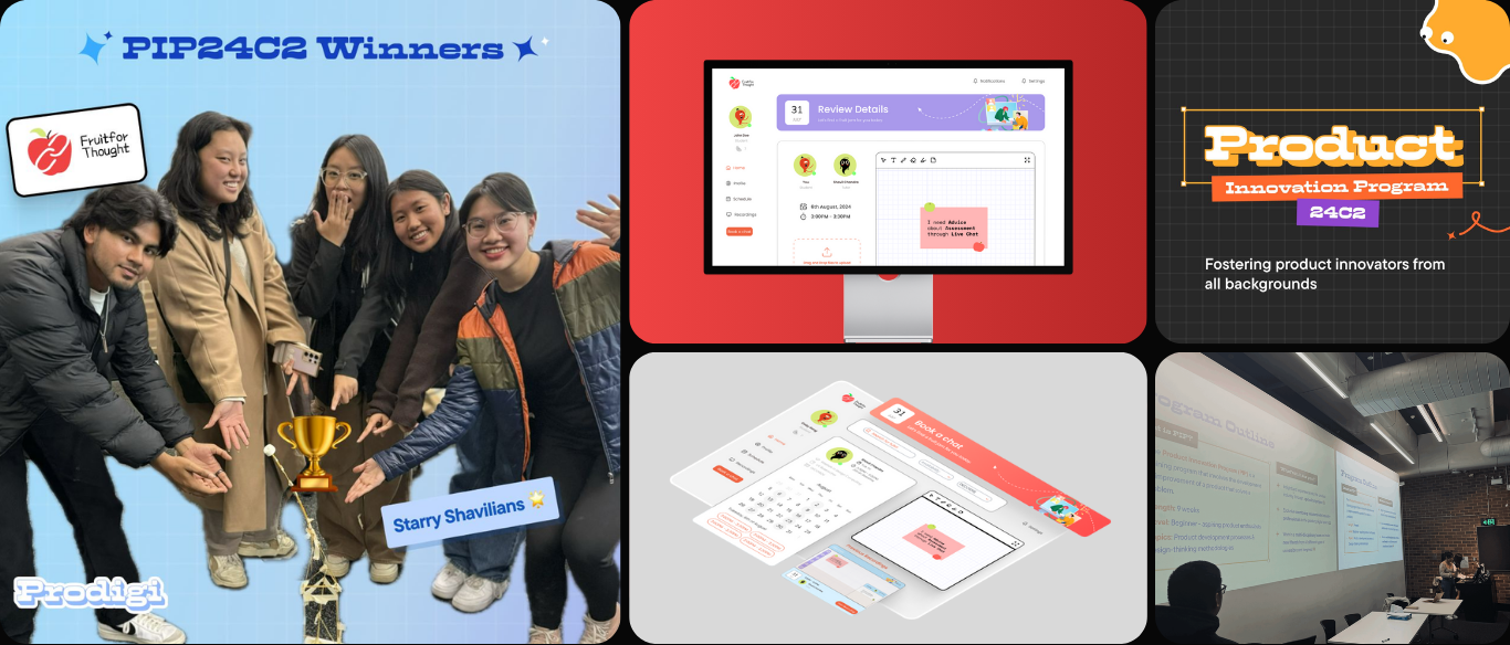
'Fruit for Thought' is a powerful student-tutor consultation platform tackling communication issues in academic settings. As part of Prodigi’s Product Innovation Program, I worked as a Product Designer and UX Researcher in this intensive 9-week project.
We competed against more than 5 different design teams. Our brief was to design a digital solution addressing key academic challenges in education. Drawing from our own experiences as design students, we asked a simple question: why not solve the problems we were facing ourselves?...
To begin with, what is Prodigi?
Prodigi is a student-led institution that extends design learning beyond the classroom. They immerse students in real-world scenarios where theory becomes action. Through hands-on programs, industry challenges, and team projects, Prodigi simulates the fast-paced, constraint-driven environment of actual product teams, making learning dynamic and exciting.
The Problem
» Academic communication often fragment student workflows instead of helping them stay organised, motivated, and on track.
University students struggle with limited tutor support, missed emails, and delayed responses, creating communication gaps. This project addresses these challenges with a streamlined digital system for timely feedback, consistent interaction, and stronger academic connections.

The Solution - a glimpse
By week 9, I designed an intuitive dashboard that centralizes collaboration, progress tracking, and goal management. It streamlines communication, helping students stay organized, connected, and motivated throughout their studies.
Research
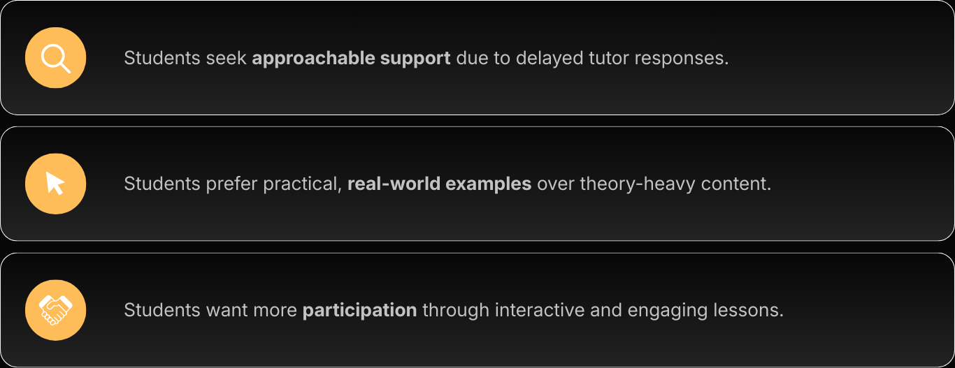
» Many students want a more approachable, reliable way to connect with tutors without the anxiety of formal outreach or lost communication.
[Market Research]
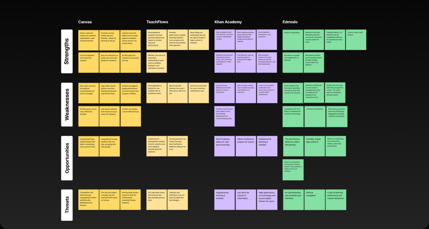
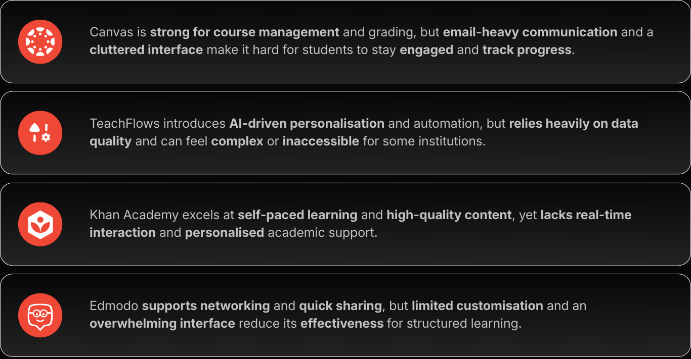
Analysing Competitors
I led the UX research for the team, synthesising competitor insights through a focused SWOT analysis. By distilling a large volume of information, we identified key patterns and opportunities that helped shape the overall concept direction...
[Affinity Mapping]
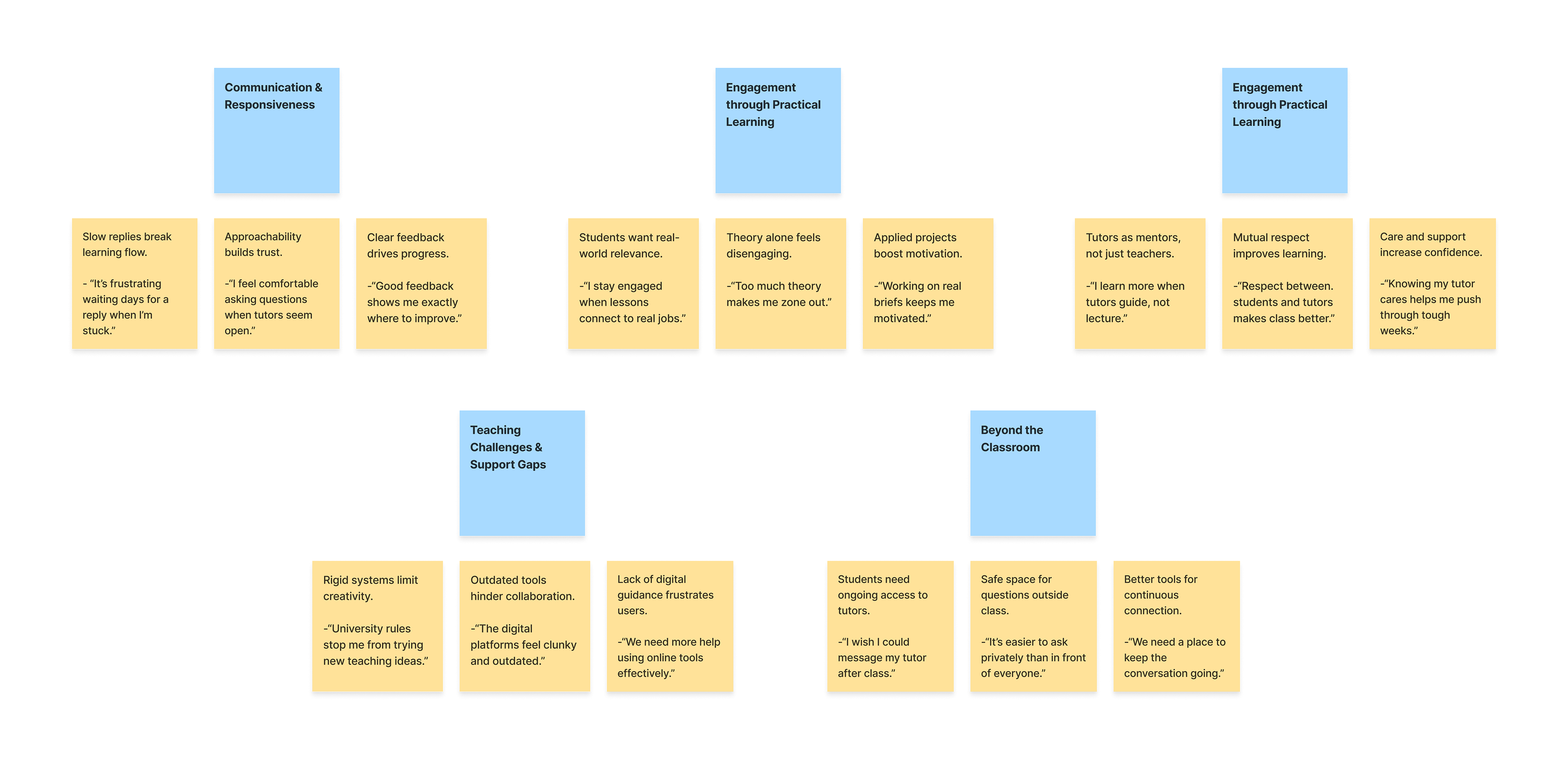
Semi-Structured Interview - Key Quotes
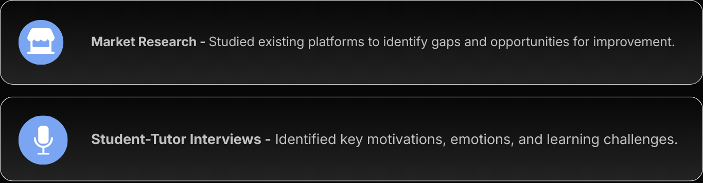
After we gathered key data regarding what our competitors lacked, we conducted semi-structured interviews with our three participants, 2 university students and 1 tutor.
[Affinity Mapping]
Semi-Structured Interview - Findings
Ideation
» Now's the fun part:) It's time for all the ideas to hit the paper!
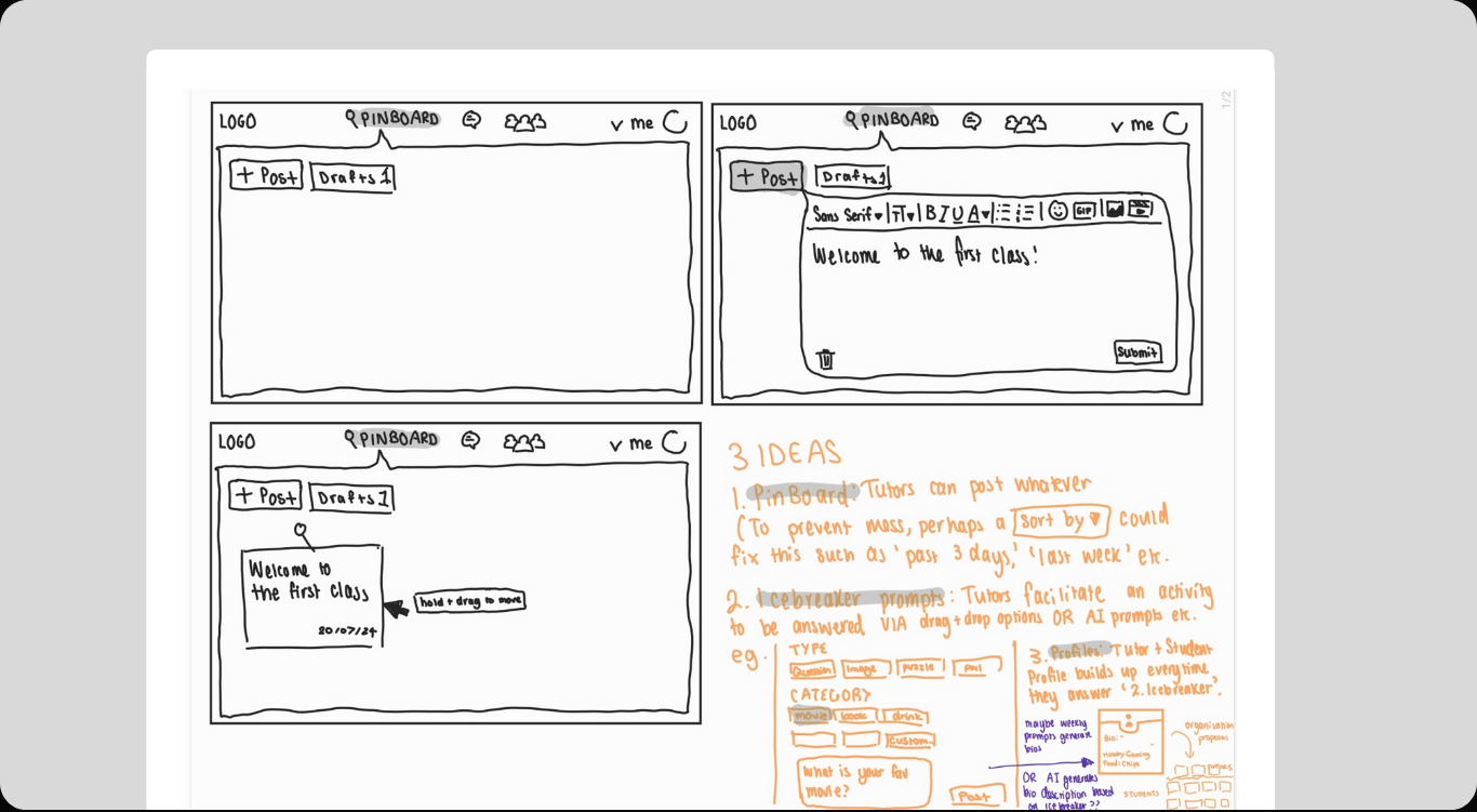
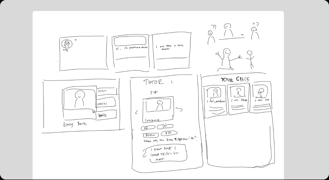
Low-Fidelity Sketches.
At this point in the process, we had just about 2 weeks left till the deadline. We had to complete our low-fidelity sketches, as well as mid-fidelity and high-fidelity designs. The clock was ticking, and every decision had to be intentional and purposeful. After thorough discussions during team meetings, we decided to design an optimised consultation platform that eradicates the common struggles of university students.
Challenge
» Navigated an unexpected spanner in our workflow.
Shortly after low-fidelity development, our product manager had to hurriedly travel overseas for a family emergency, leaving the team to drive key decisions independently. I stepped up to lead coordination, initiating regular check-ins and ensuring all progress made my team members aligning aligned and maintained momentum.
Every decision was carefully documented so we could clearly communicate progress and rationale when our product manager returned in a week.
[Mid-Fidelity Prototyping]
» Reached the half-way point, paving the way for completion!
With concepts defined, the project moved into mid-fidelity prototyping, refining wireframes and interactive elements. Feedback guided improvements in clarity and usability, while Figma's Auto Layout ensured consistent alignment and responsive spacing for the high-fidelity prototype.
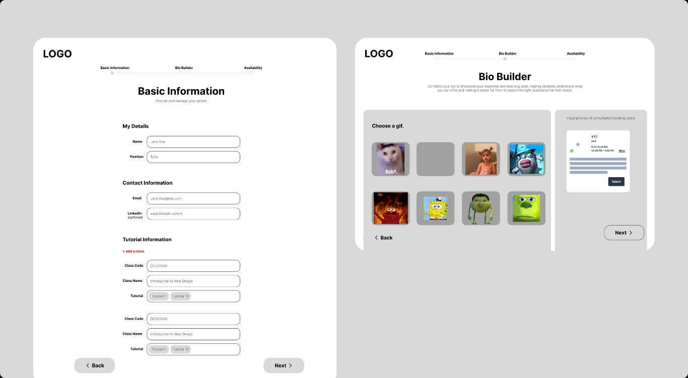
01 Tutor Bio Builder.
This mid-fidelity prototype explores the tutor onboarding flow, testing content structure, information hierarchy, and input patterns. It focuses on how expertise, availability, and teaching details are organised to support clarity and reduce friction during profile setup.
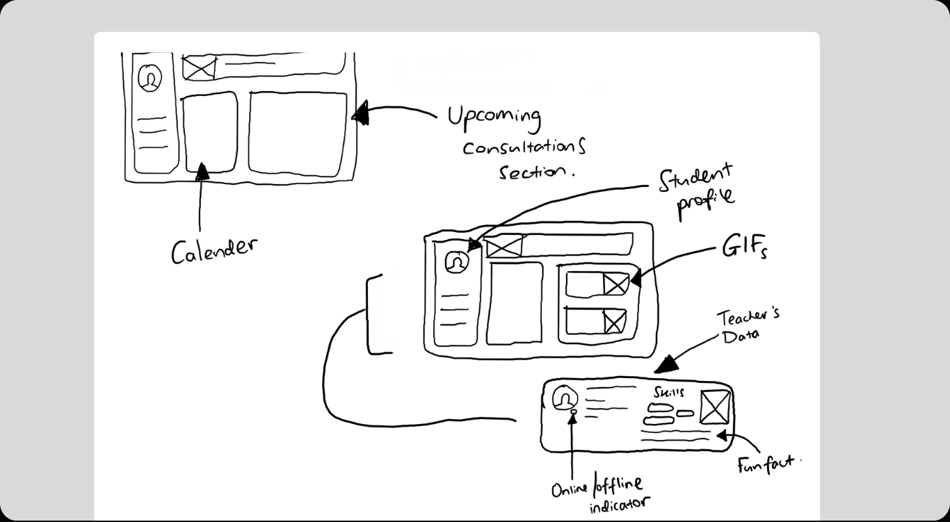
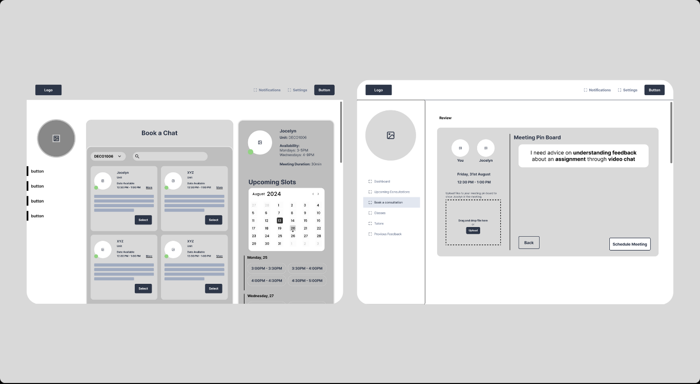
02 Streamlined Consultation Booking.
We designed the booking flow to test layout, information hierarchy, and interaction patterns. By bringing tutor discovery, availability, and session details into one view, this screen evaluates how students navigate choices and progress toward booking with clarity.
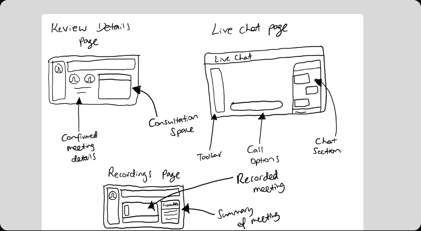
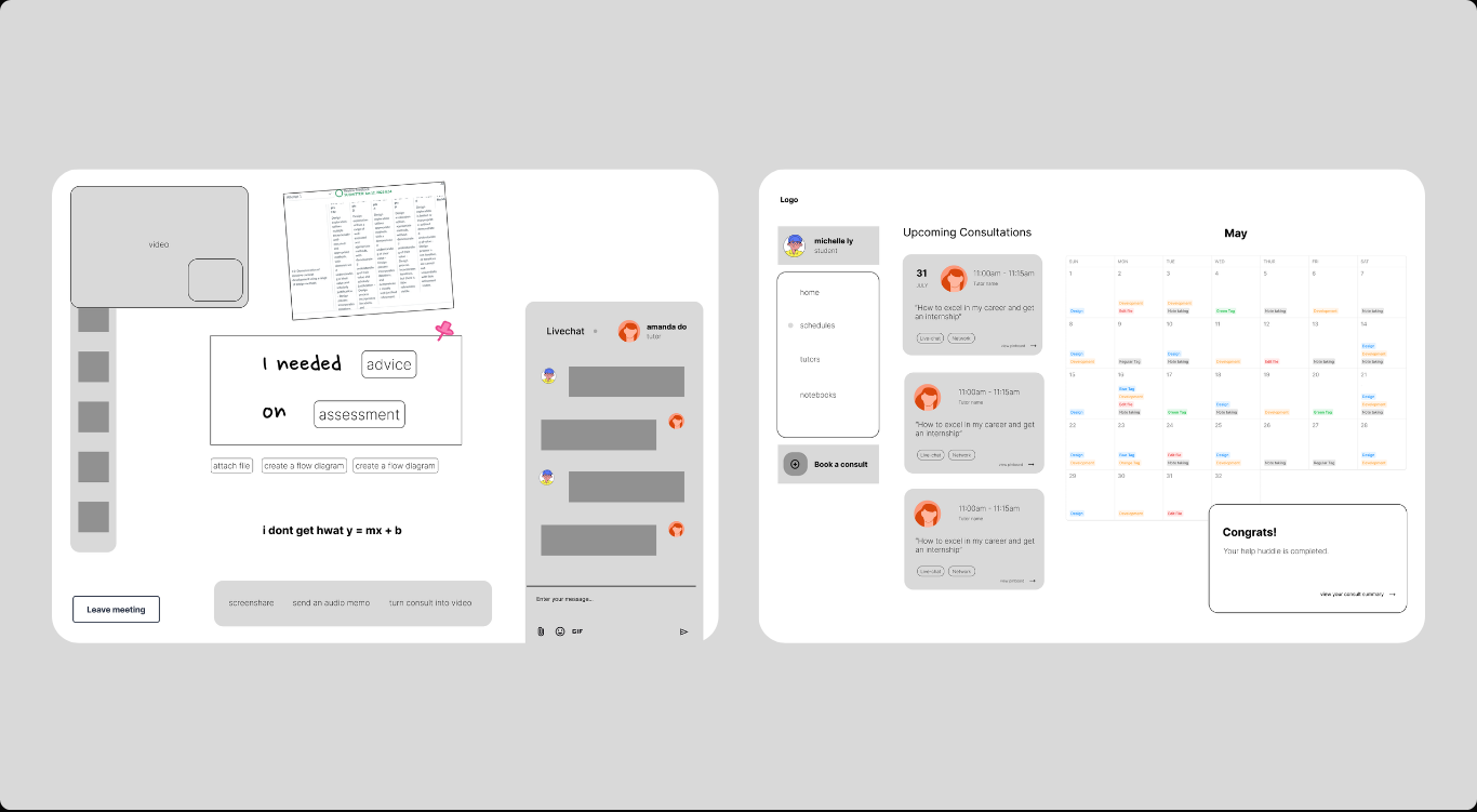
03 Live Consultation & Post-Session Flow.
A structural exploration of the live consultation experience, focusing on layout, interaction flow, and key touchpoints before and after a session. This mid-fidelity prototype tests how students share context, communicate with tutors in real time, and receive clear confirmation once a consultation is completed.
Usability Testing
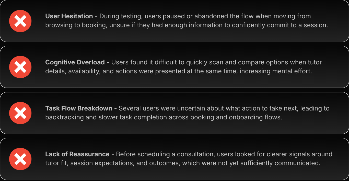
» What friction did users encounter?
Usability testing revealed hesitation, cognitive overload, and uncertainty in the booking flow. These insights guided refinements to improve clarity, reduce friction, and support more confident decision-making.
The Final Outcome
Extensive research and iterative testing guided every design decision, allowing insights to evolve into a focused, user-centred solution that effectively addressed communication gaps and improved the overall learning experience.
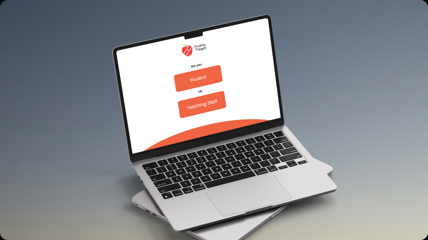
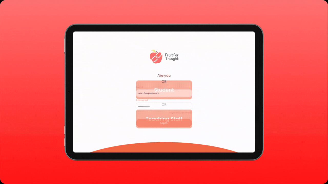
01 A Refined Onboarding Experience.
Building on mid-fidelity testing insights, this high-fidelity onboarding clarifies user roles, reduces cognitive load, and adds reassuring feedback through refined hierarchy and interaction design. The result is a confident, intuitive first step that removes hesitation and sets clear expectations from the outset.
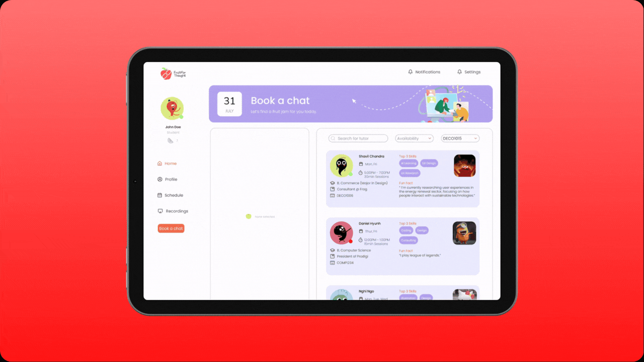
02 A Streamlined Academic Consultation Space!
The consultation flow enhances clarity with progressive disclosure, strong visual hierarchy, and clear interaction cues. GIFs and subtle motion add warmth, while tutor info and next steps guide users seamlessly, transforming the booking process into a focused, low-friction experience.
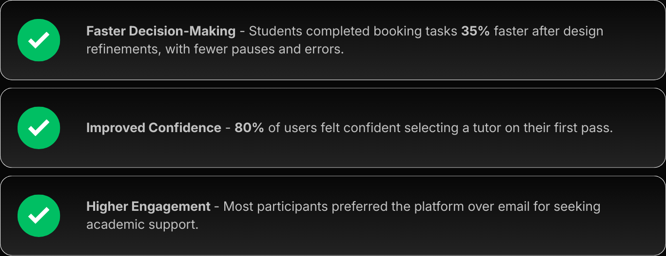
The Impact
Post-iteration usability testing confirmed the platform reduced friction in seeking academic support, enabling students to move from hesitation to action with confidence. By the Prodigi board presentation, the design achieved its goal: replacing fragmented communication with a focused, engaging system for timely academic interaction.
[Retrospective]
Learnings & Key Takeaways
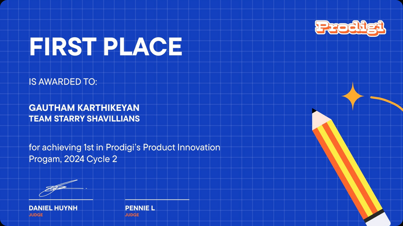
Being my second design project, Fruit for Thought marked a turning point in how I approached collaboration and craft. Winning first place in Prodigi’s 2024 Product Innovation Program, I learned to manage time effectively, communicate within a diverse team, and maintain focus in a clean, organised workspace. The experience strengthened my ability to balance function with aesthetics and refine my visual details in line with Nielsen’s heuristics.
One of the biggest challenges was collecting feedback from shy, introverted students, which I overcame by building trust through open, casual conversations. This project taught me to design not just for visual impact but for meaningful, human-centred interaction - lessons that I continue to carry into every new project.