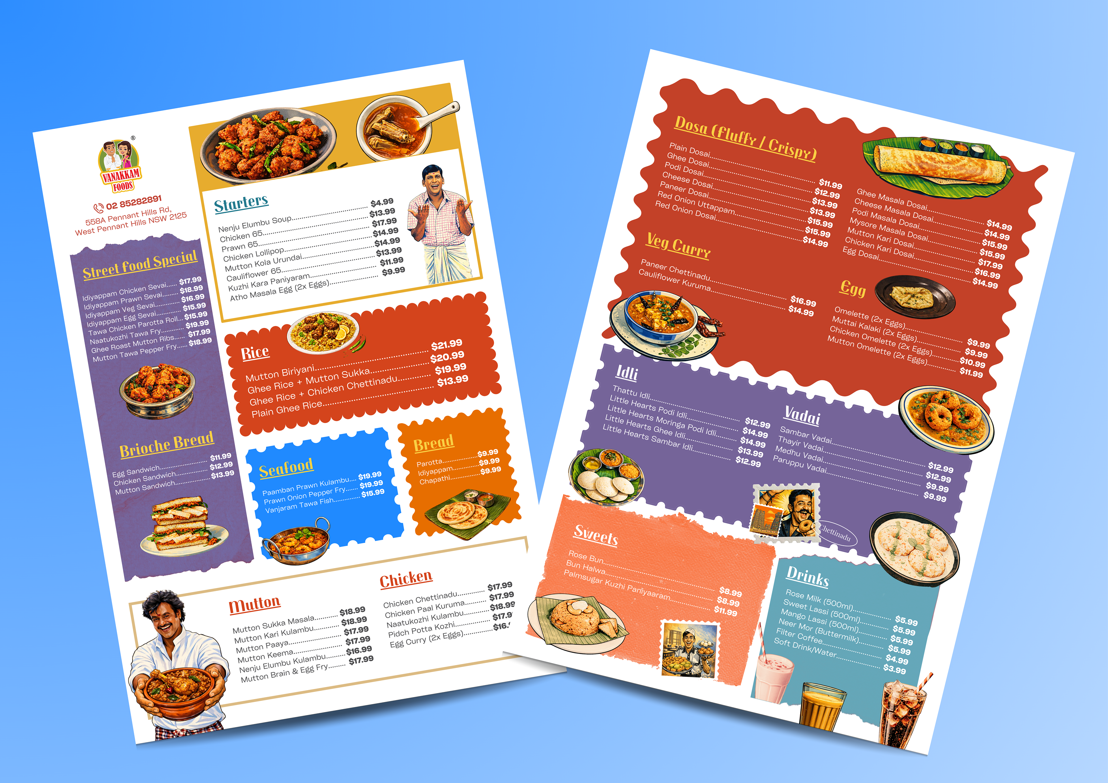
Vanakkam Foods - Menu Design
March 2026
March 2026
I was appointed by the owner of Vanakkam Foods in Pennant Hills to design a menu that captured the restaurant’s lively and expressive atmosphere. He wanted something fun and playful that aligned with the interior design of the restaurant, so I leaned into bold South Asian design elements and cinematic influences inspired by South Indian film culture. The layout also reflects the roots of the cuisine, drawing from the Sivagangai district in Tamil Nadu through both visual cues and retro-inspired visual narrative. The final outcome is energetic yet structured, bringing personality to the brand while keeping the menu clear and easy to navigate.
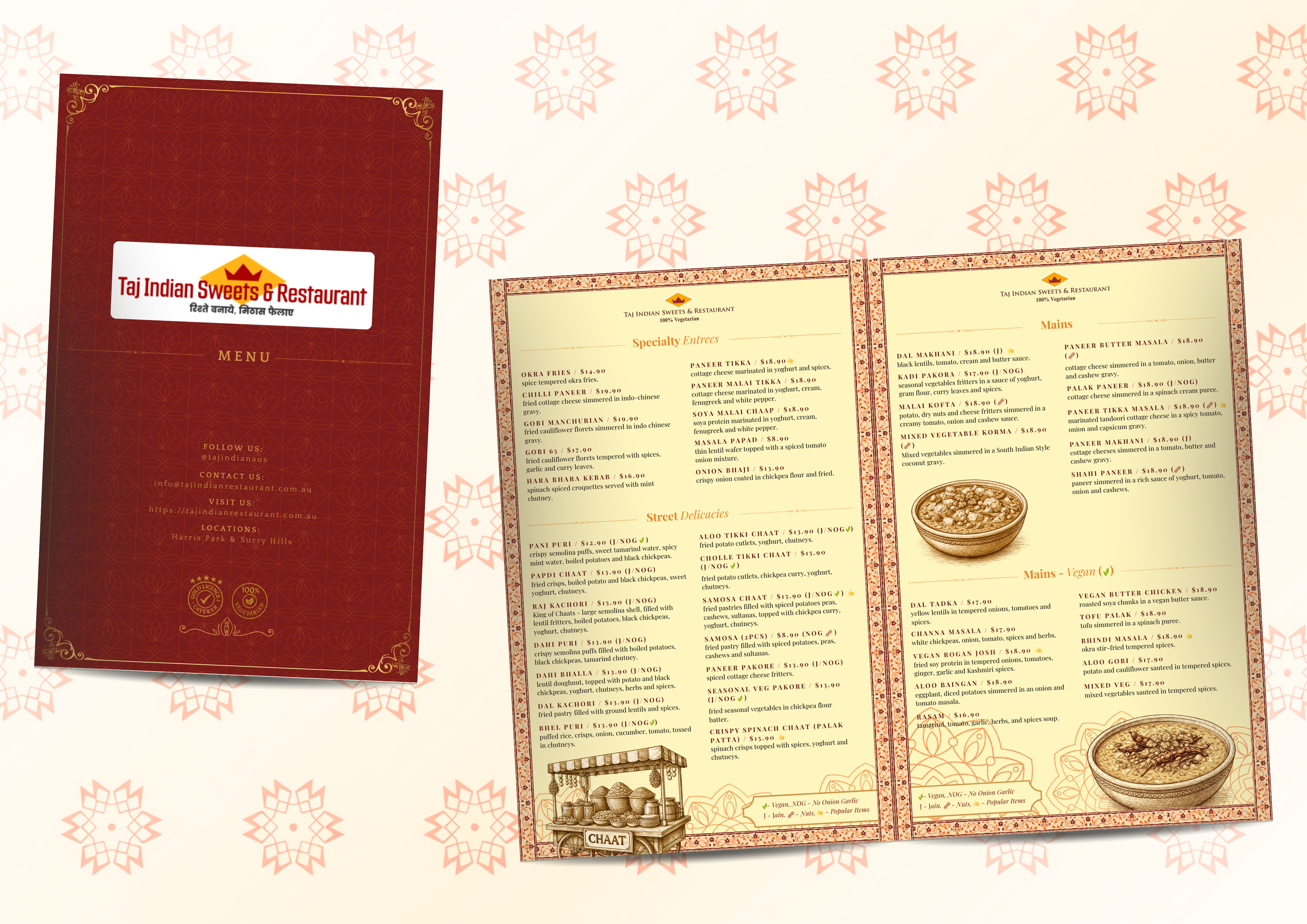
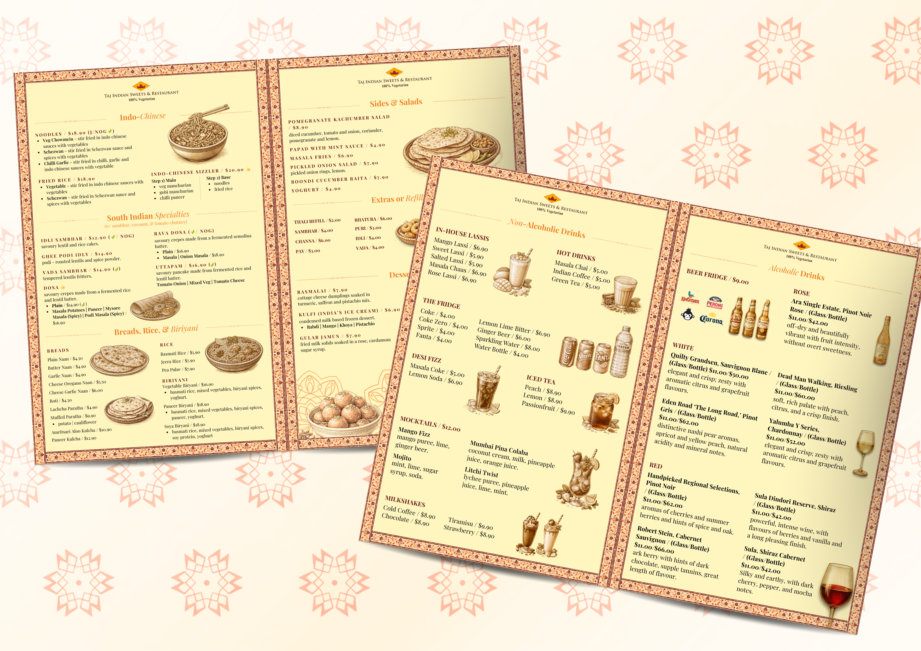
Taj Indian Sweets & Restaurant - Menu Design
January 2026
January 2026
I was commissioned to redesign the menu for Taj Indian Sweets & Restaurant, the first Indian restaurant established in Harris Park, Parramatta. The project focused on translating its legacy into a cohesive visual system, combining traditional Indian motifs with a structured, easy-to-navigate layout. I developed a scalable design across multiple pages, ensuring consistency in typography, hierarchy, and imagery while improving readability and customer flow. The final outcome balanced cultural authenticity with modern usability, reinforcing Taj’s identity while enhancing the dining experience.
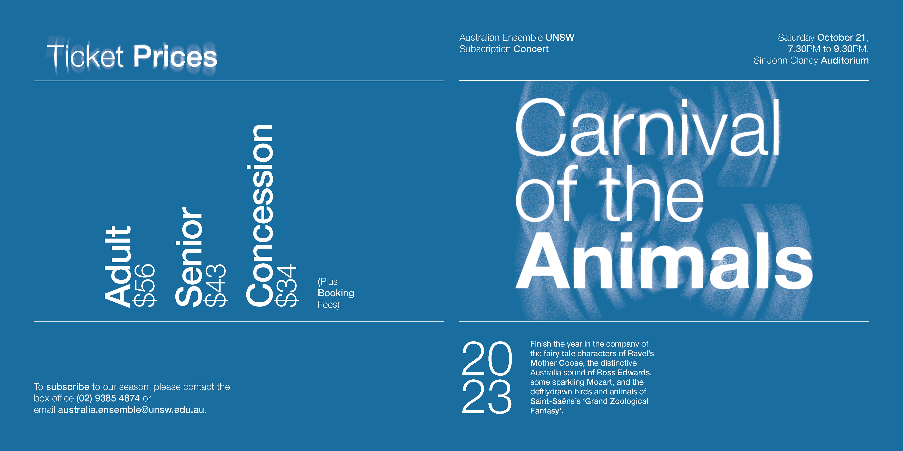
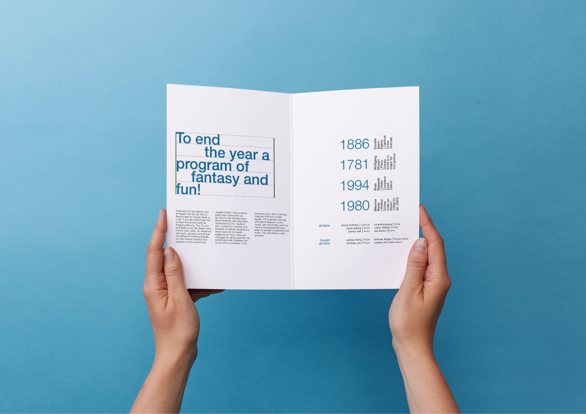
Carnival of the Animals - Publication Brochure Design
September 2025
September 2025
This four-page brochure created through InDesign was in response to a real client brief for Australia Ensemble UNSW, promoting the Carnival of the Animals concert. Working within strict format, colour, and print constraints, I adopted a “type as image” approach to engage a student audience through expressive typography and hierarchy rather than illustration. The aim was to tell a story using typography alone, with a sound-driven concept expressed through waveforms in the title and audio-bar motifs in the pricing hierarchy. The layout balances clarity and atmosphere, ensuring key event details remain legible while the typographic treatment conveys the playful, theatrical tone of the performance. The final outcome reflects close adherence to the brief, careful typographic decision-making, and preparation for professional digital print.
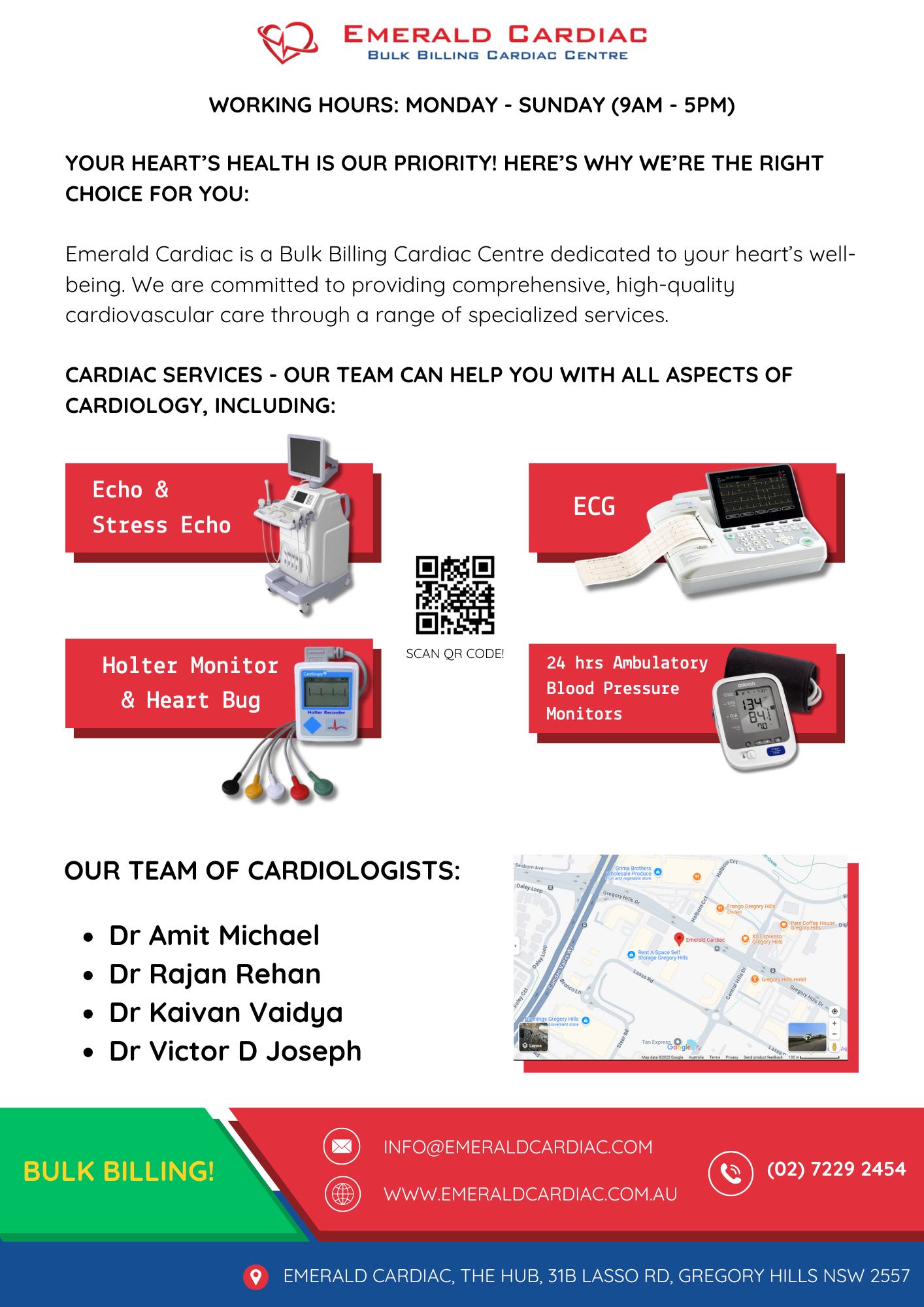
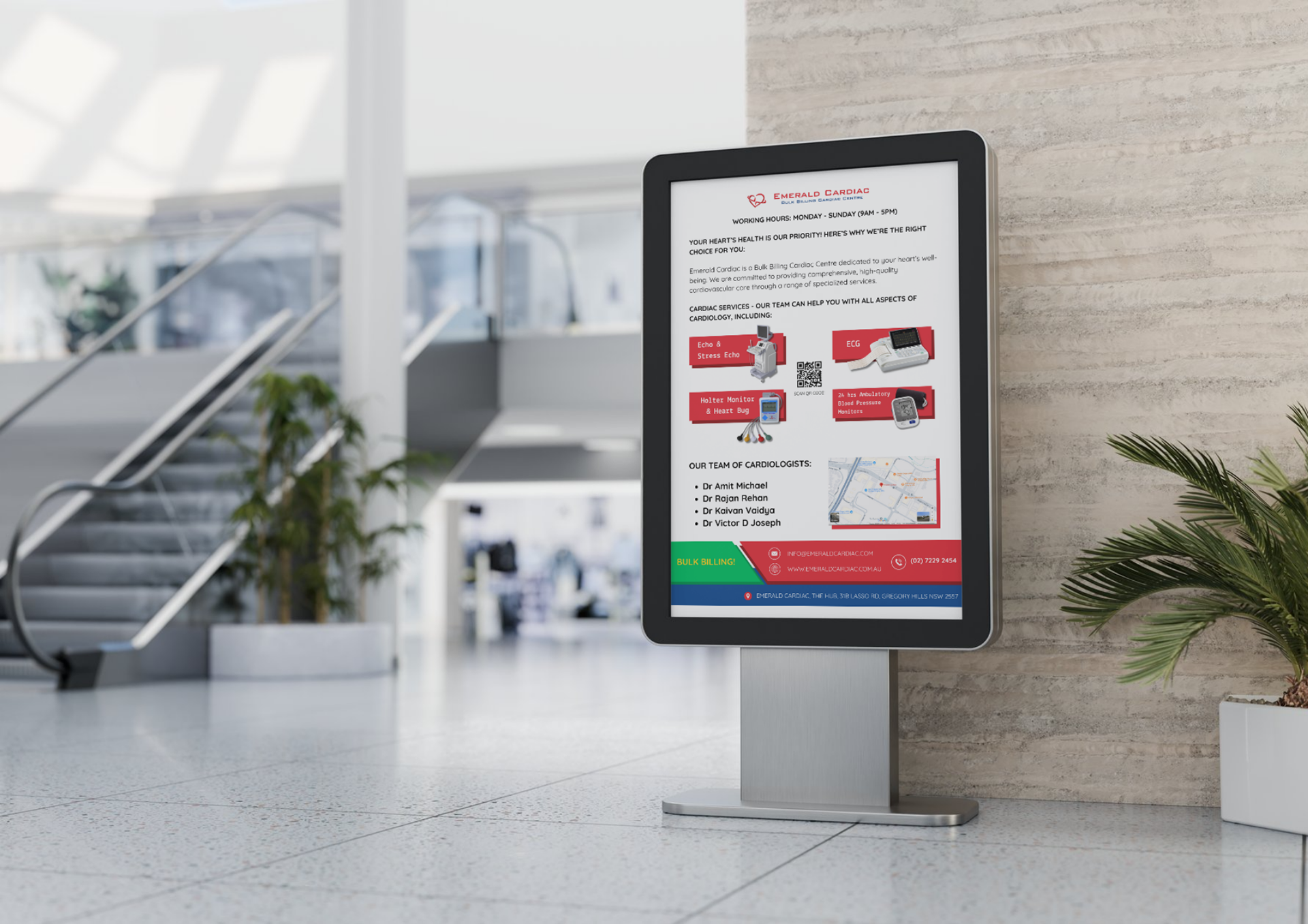
Emerald Cardiac - Infographic
March 2025
Emerald Cardiac is a cardiology clinic based in Gregory Hills, NSW. They reached out to me requesting an infographic to promote their business. Using a clear, professional layout, bold typography, and visuals of the relevant medical equipment, this design highlights their comprehensive heart health services.
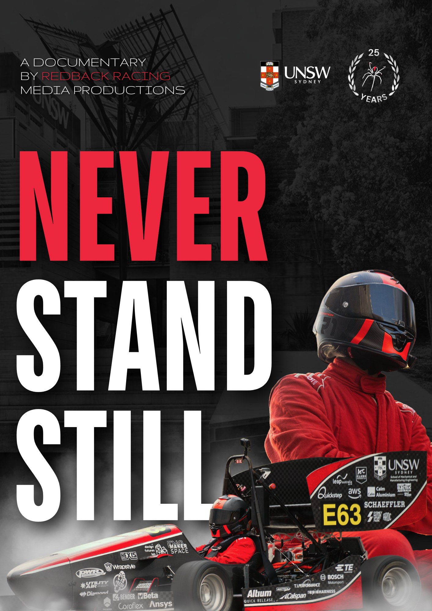
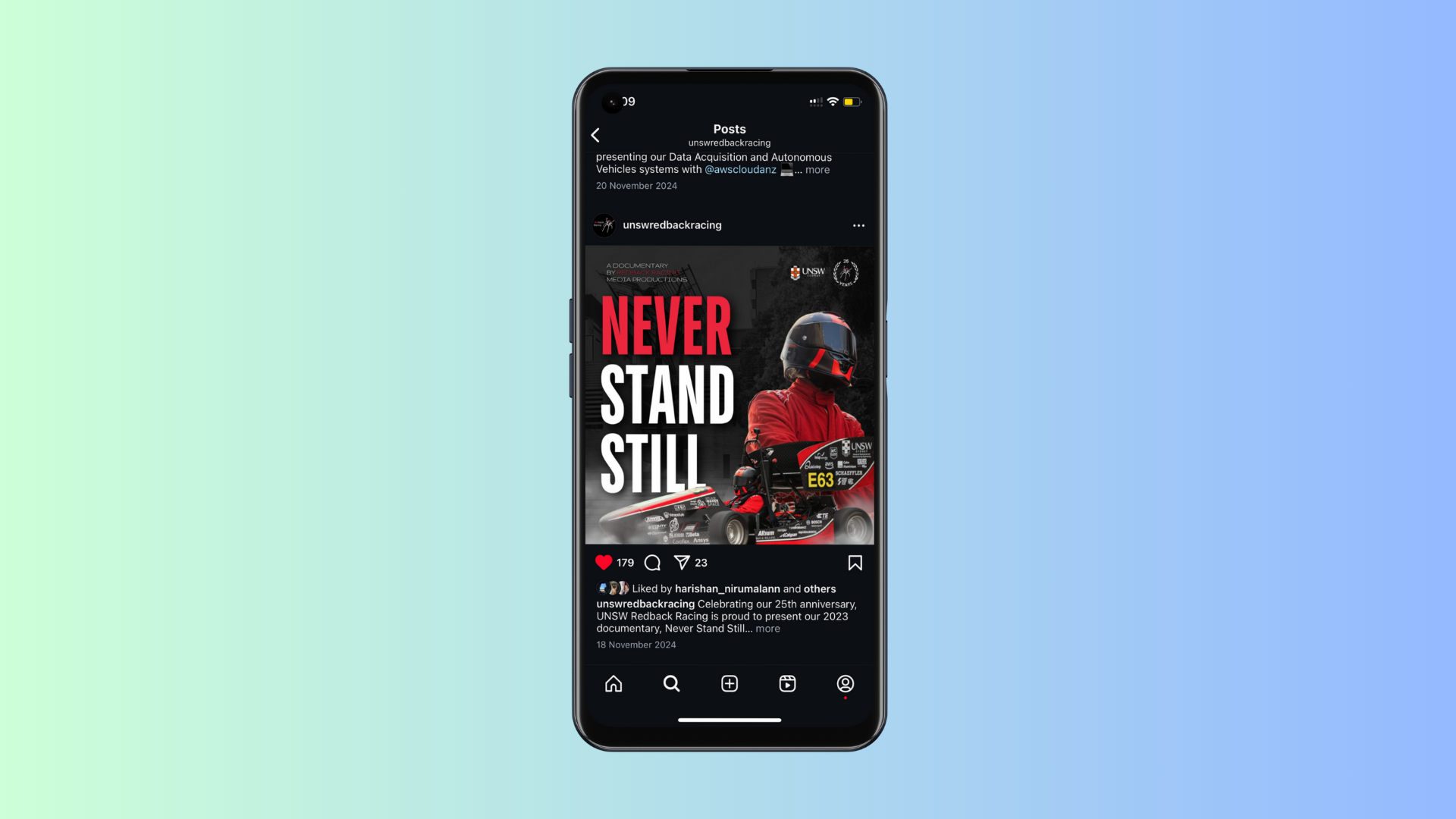
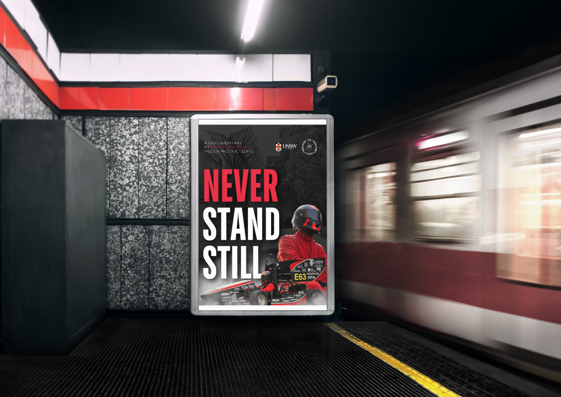
UNSW Redback Racing - 'Never Stand Still' Documentary Social Media Marketing Post
November 2024
November 2024
Being my first project as a graphic designer in the Redback Racing team, I was tasked to design this poster to promote Redback Racing’s documentary “Never Stand Still”. The dramatic contrast of bold typography and atmospheric imagery reflects the team’s relentless drive, while the inclusion of UNSW and anniversary branding roots the film in both heritage and innovation. The design captures a cinematic tone, building anticipation for the documentary and reinforcing the team’s narrative of progress and resilience.
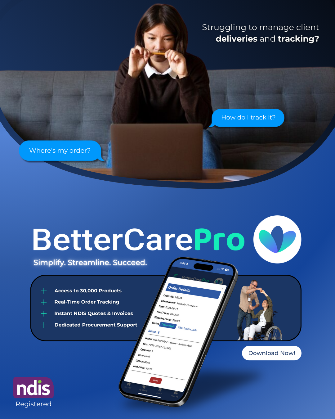
BetterCareMarket - Ad Campaign
April 2025
April 2025
This ad campaign for BetterCareMarket was designed to connect with NDIS professionals facing the challenges of managing client deliveries and procurement. The visual narrative captures common frustrations and presents their app, BetterCarePro, as a streamlined, NDIS-registered solution—offering real-time tracking, instant quotes, and dedicated support. Clean, accessible design reinforces trust and usability at every touchpoint.
Key Iteration 1
Key Iteration 2
Key Iteration 3
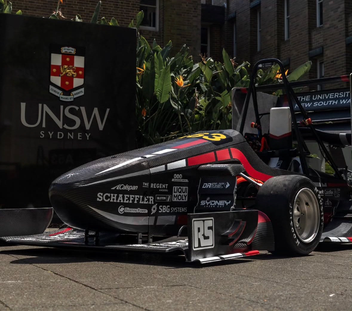
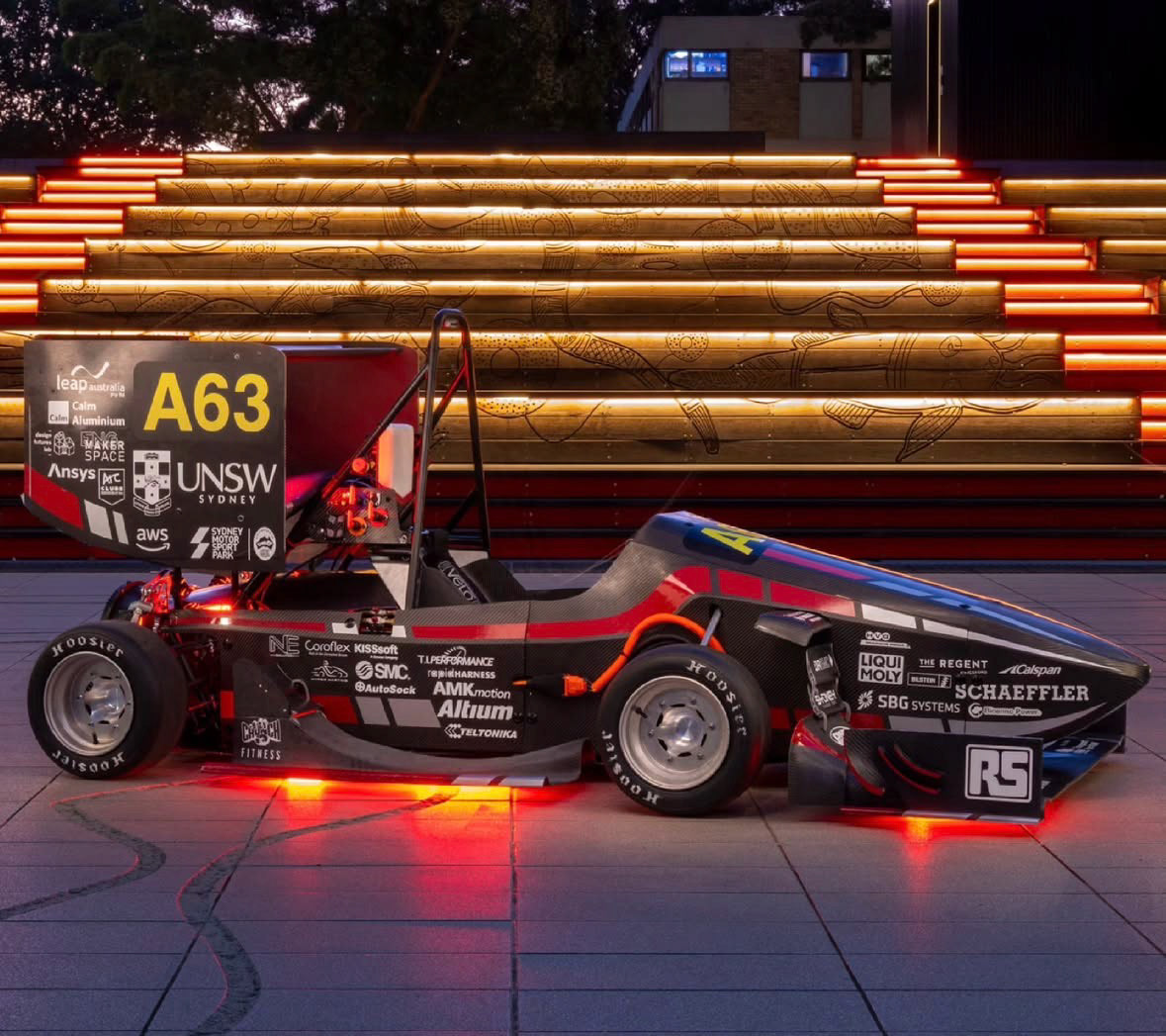
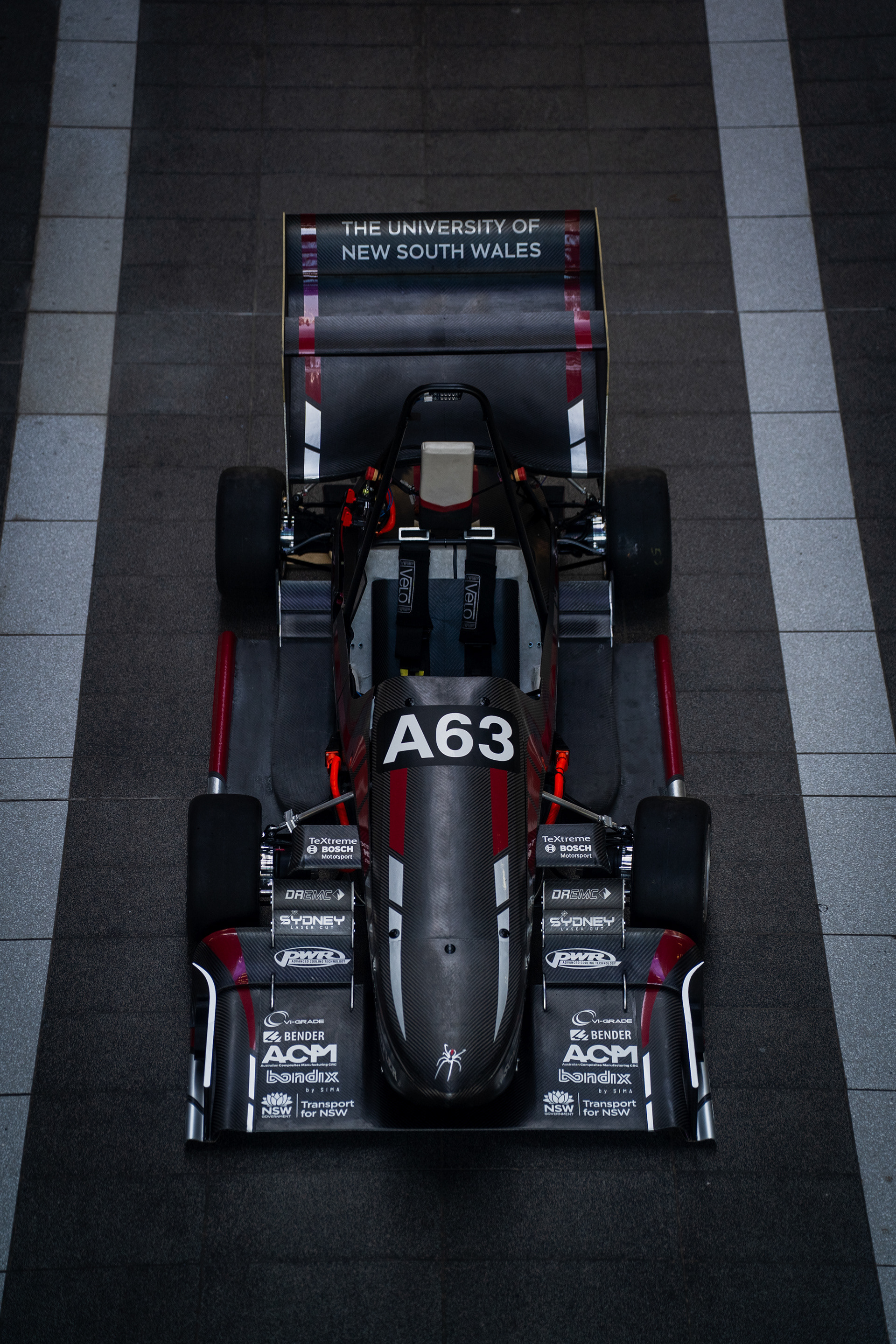
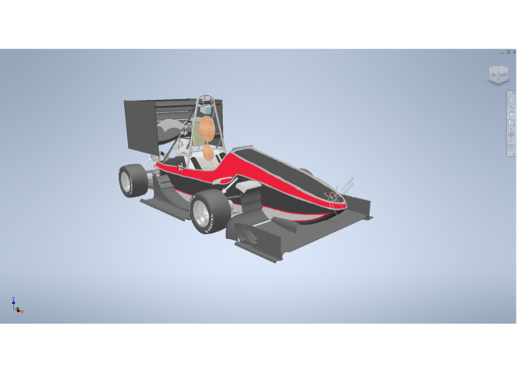
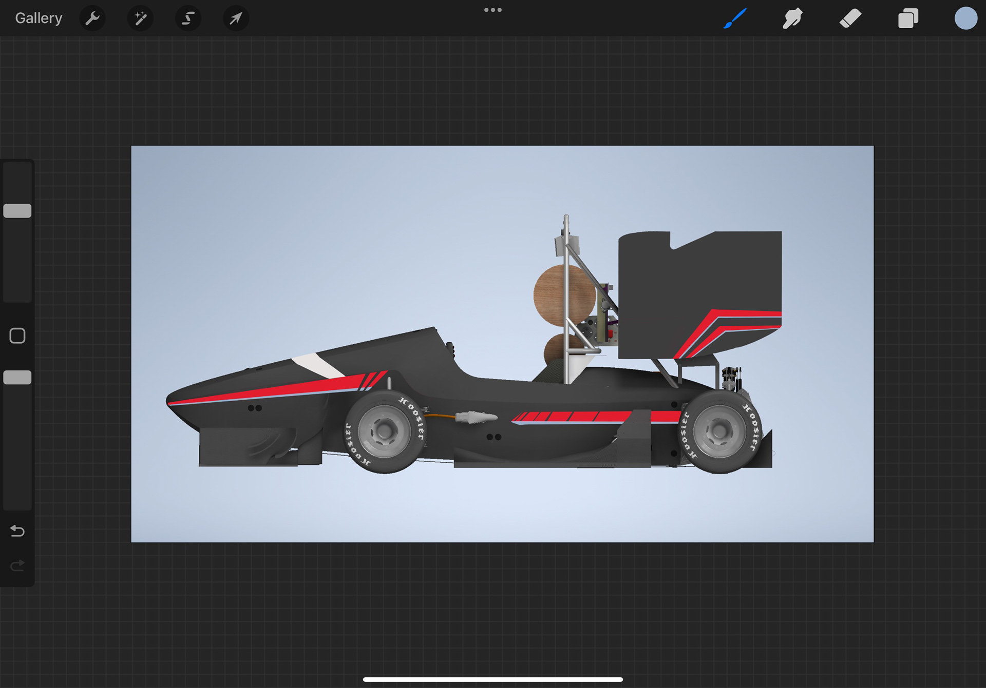
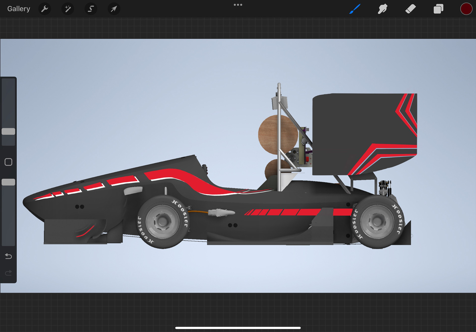
UNSW Redback Racing - Livery Design
June - October 2025
June - October 2025
My livery design process started with the idea of reflecting both performance and identity. I wanted the car to look aggressive, stylish, and modern while staying true to the team’s heritage. The base colour choice came first, setting a clean foundation for layering the details. From there, I explored shapes that flowed with the car’s body lines to create a sense of movement even when it was stationary. The red accents were used to emphasise energy and speed, while the white details added contrast and clarity for sponsors. I kept refining small details like the thickness of stripes and placement of the UNSW and partner logos to maintain balance without overcrowding the bodywork. The spider emblem became the final signature element, symbolising precision and control. Each iteration was a step towards a design that felt both competitive and distinctly ours.
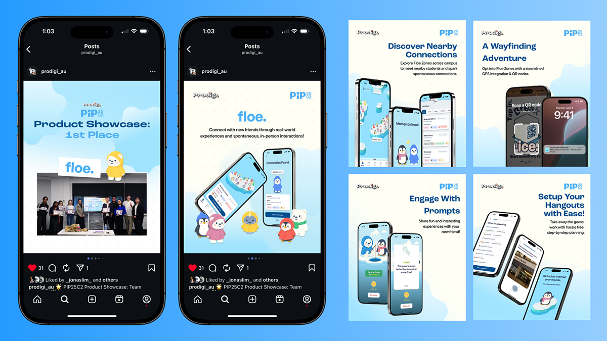
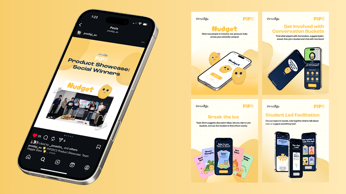
Prodigi PIP25C2 Results • 1st & 2nd Place Social Media Posts
August 2025
I designed a set of social media posts celebrating the two winning teams from Prodigi PIP24C2, translating each product’s identity into a distinct visual system. The posts balance clarity and celebration, combining bold hierarchy, device mockups, and consistent branding to clearly communicate outcomes while showcasing each concept’s value. The result is a cohesive yet differentiated set of posts designed for high impact across social platforms.
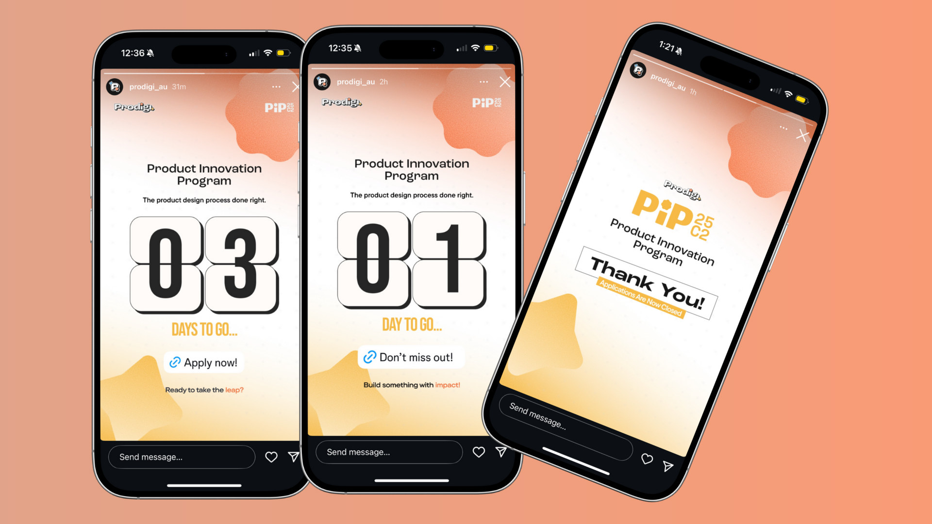
Prodigi - PIP25C2 Application Countdown Social Media Marketing Post
May 2025
I designed a sequence of countdown and announcement posts for the Prodigi Product Innovation Program, using bold typographic hierarchy and motion-inspired layouts to build anticipation and clearly signal key milestones. By combining urgency with clarity, the posts increased attention and drove higher engagement in the lead-up to applications closing, supporting stronger program visibility across social platforms.
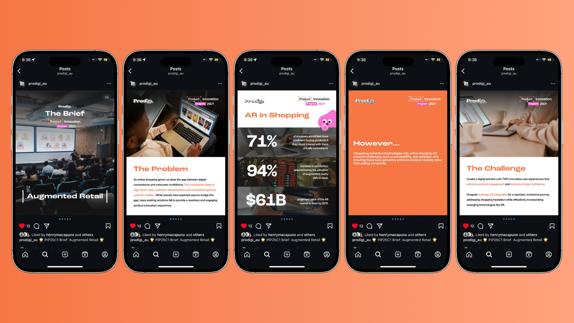
Prodigi - PIP25C1 Brief: Augmented Retail Social Media Marketing Post
May 2025
I designed a carousel-style social post to introduce the Product Innovation Program brief, breaking down complex problem framing into clear, swipeable stages. Through strong typographic hierarchy, data-led storytelling, and a consistent visual system, the post guided audiences from context to challenge with clarity. This approach improved comprehension of the brief and increased audience interest, driving stronger engagement and participation at the start of the program cycle.
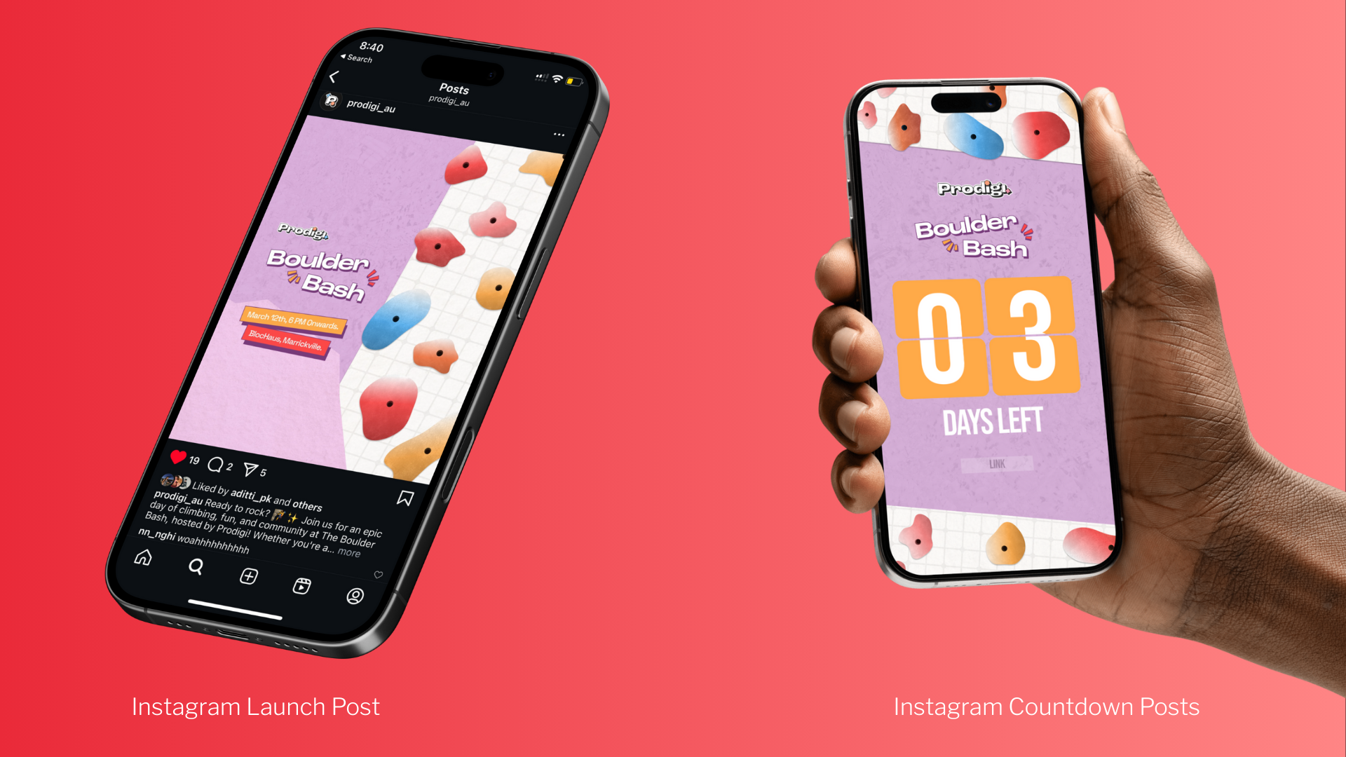
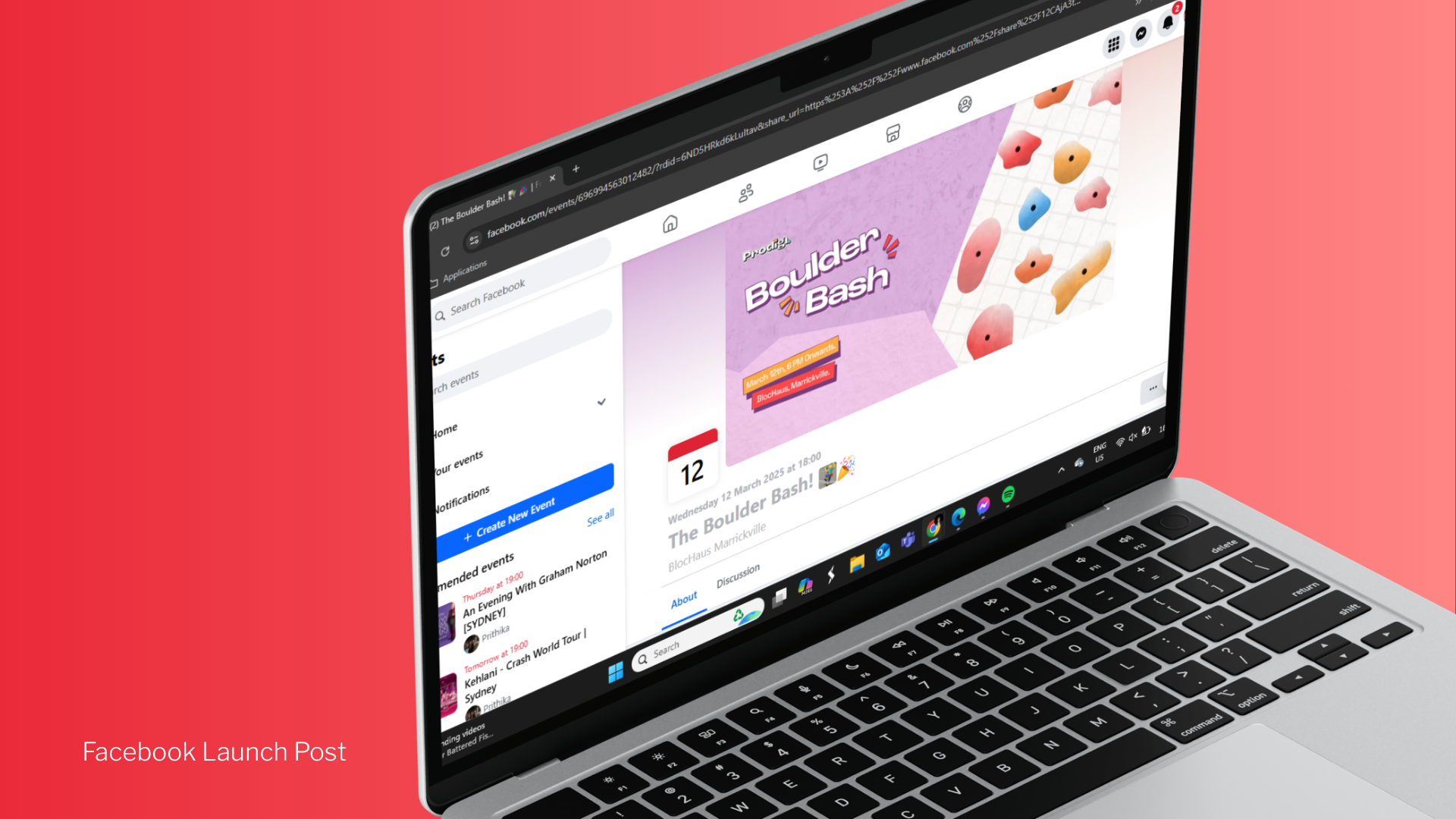
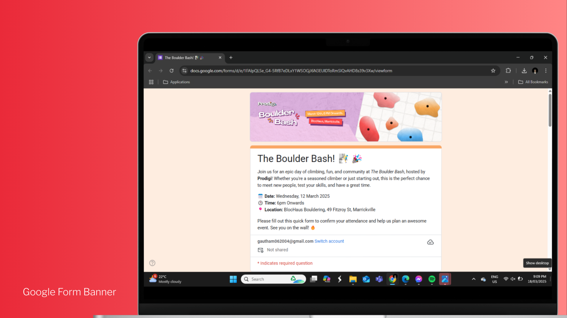
Prodigi - Boulder Bash Event Social Media Marketing Posts
March 2025
March 2025
I designed a cohesive launch system for the Boulder Bash event across Instagram, Facebook, and Google Forms, ensuring visual consistency from promotion through to sign-up. Using bold countdown mechanics, clear event details, and adaptable layouts, the posts built momentum and urgency while guiding users seamlessly toward registration. This cross-platform approach increased event visibility, boosted engagement in the lead-up to launch, and supported stronger attendance conversion.
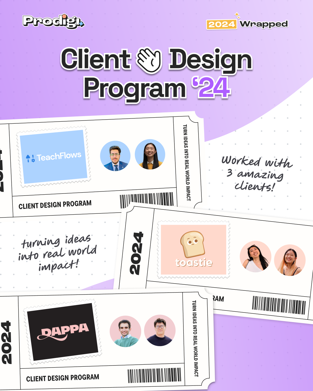
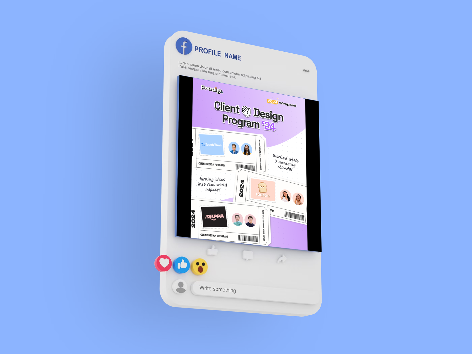
Prodigi - Marketing Material for a CDP Recap Post
January 2025
I designed this graphic to celebrate the 2024 Client Design Program, highlighting the three amazing clients we collaborated with: TeachFlows, Toastie, and Dappa. The ticket-inspired layout symbolises entry into real-world impact, while playful colours and stamp motifs keep the design engaging and celebratory. It effectively balances professionalism with creativity, showcasing client partnerships in a visually memorable way.
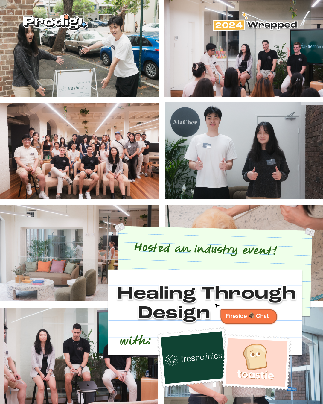
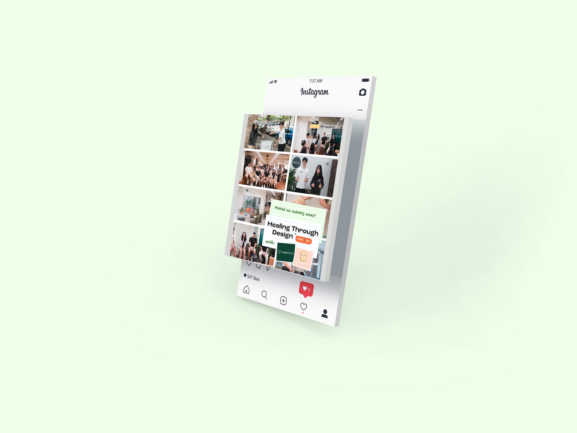
Prodigi - Marketing Material for an Industry Event
January 2025
I created this event wrap-up graphic to showcase 'Healing Through Design', an industry event we hosted with Fresh Clinics and Toastie. The collage-style layout captures key moments from the fireside chat, combining candid photography with playful graphic elements to convey both professionalism and approachability. The design balances event branding with community storytelling, making it visually engaging for both participants and wider audiences.
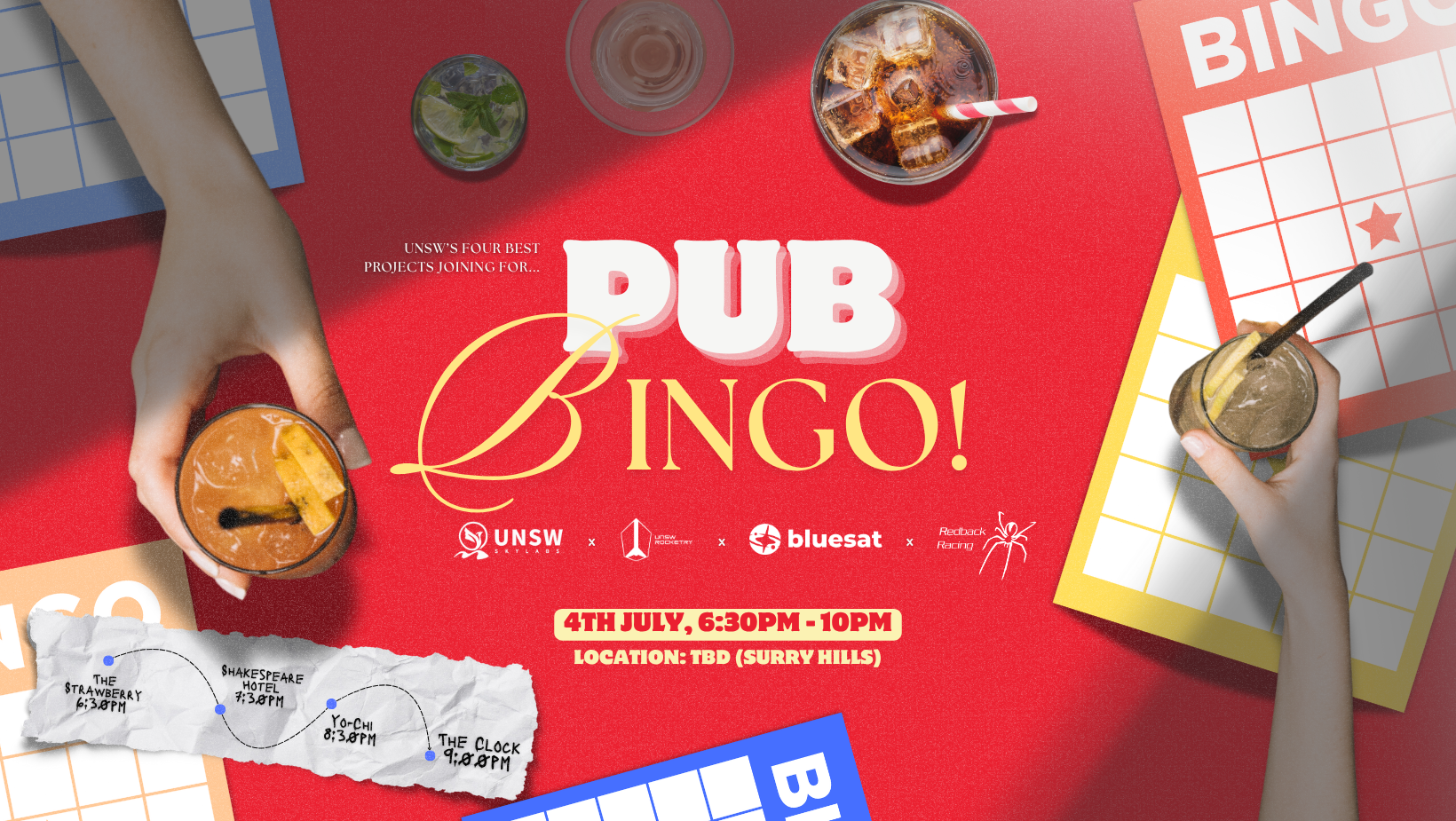
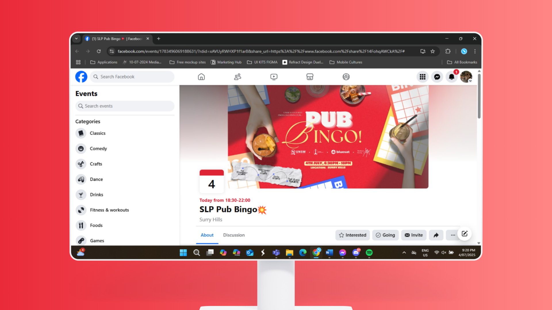
UNSW Redback Racing - Collaboration Event Social Media Marketing Post
June 2025
I was appointed by my media team in Redback Racing to promote PUB Bingo, a collaborative event in collaboration with other key UNSW societies. The playful bingo motifs and vibrant drink imagery capture the social energy of the night, while bold colours and clear typography highlight key details. The poster’s purpose was to strengthen inter-society collaboration, building friendship and professional growth through a shared, engaging event. This event had a strong turn-out rate, gathering several attendees.
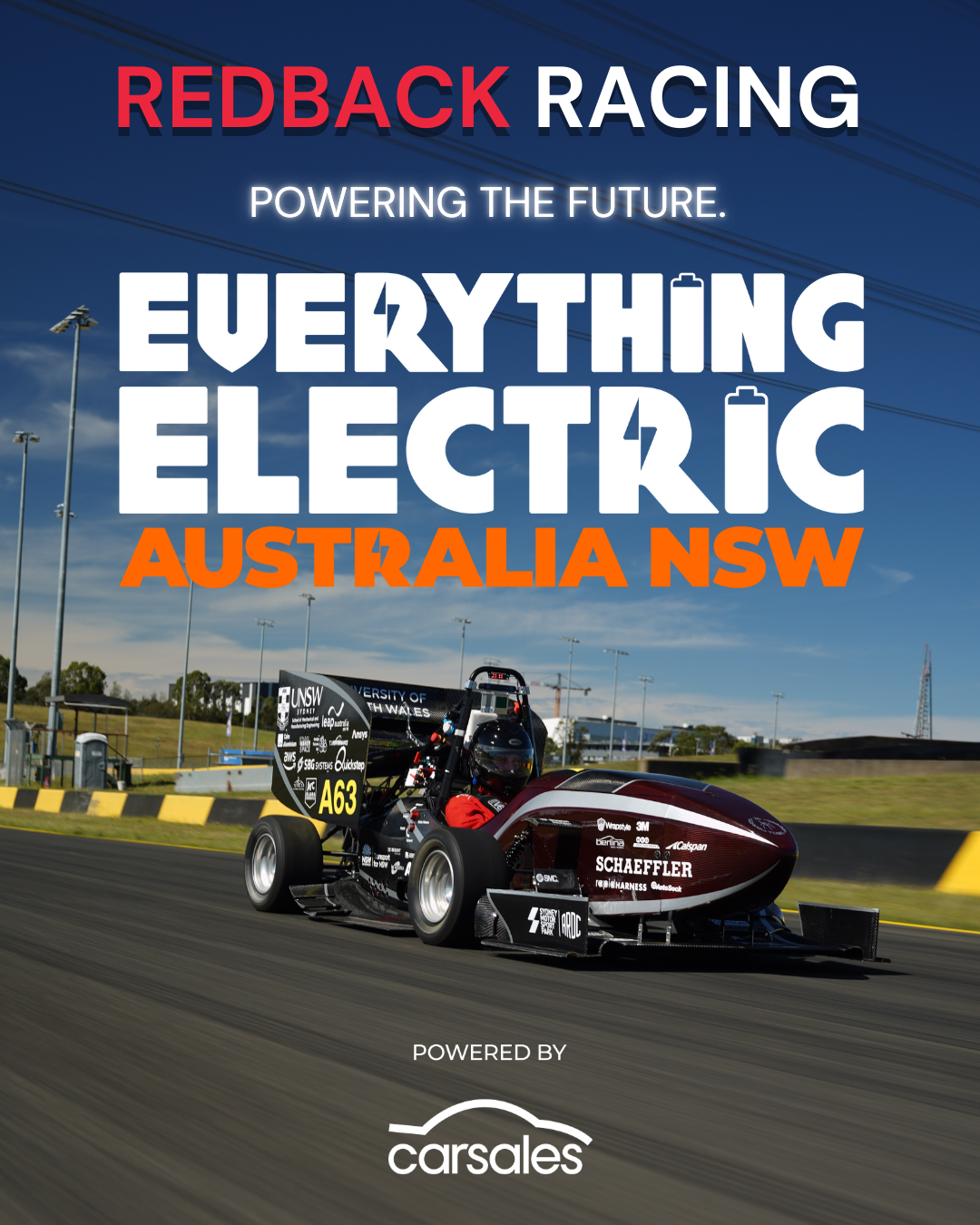
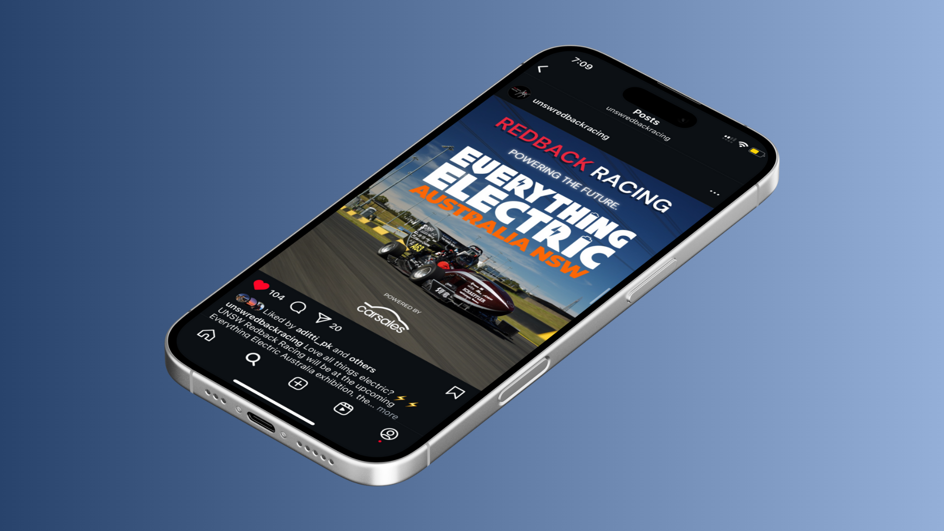
UNSW Redback Racing - 'Everything Electric' Social Media Marketing Post
February 2025
I designed this promotional graphic to highlight Redback Racing’s involvement in the Everything Electric Australia NSW event. The bold typography and electric-inspired icons emphasise innovation and sustainability, while the racing car imagery connects directly to our team’s identity and engineering achievements. The layout also integrates sponsor recognition, ensuring professional visibility and alignment with industry partners.
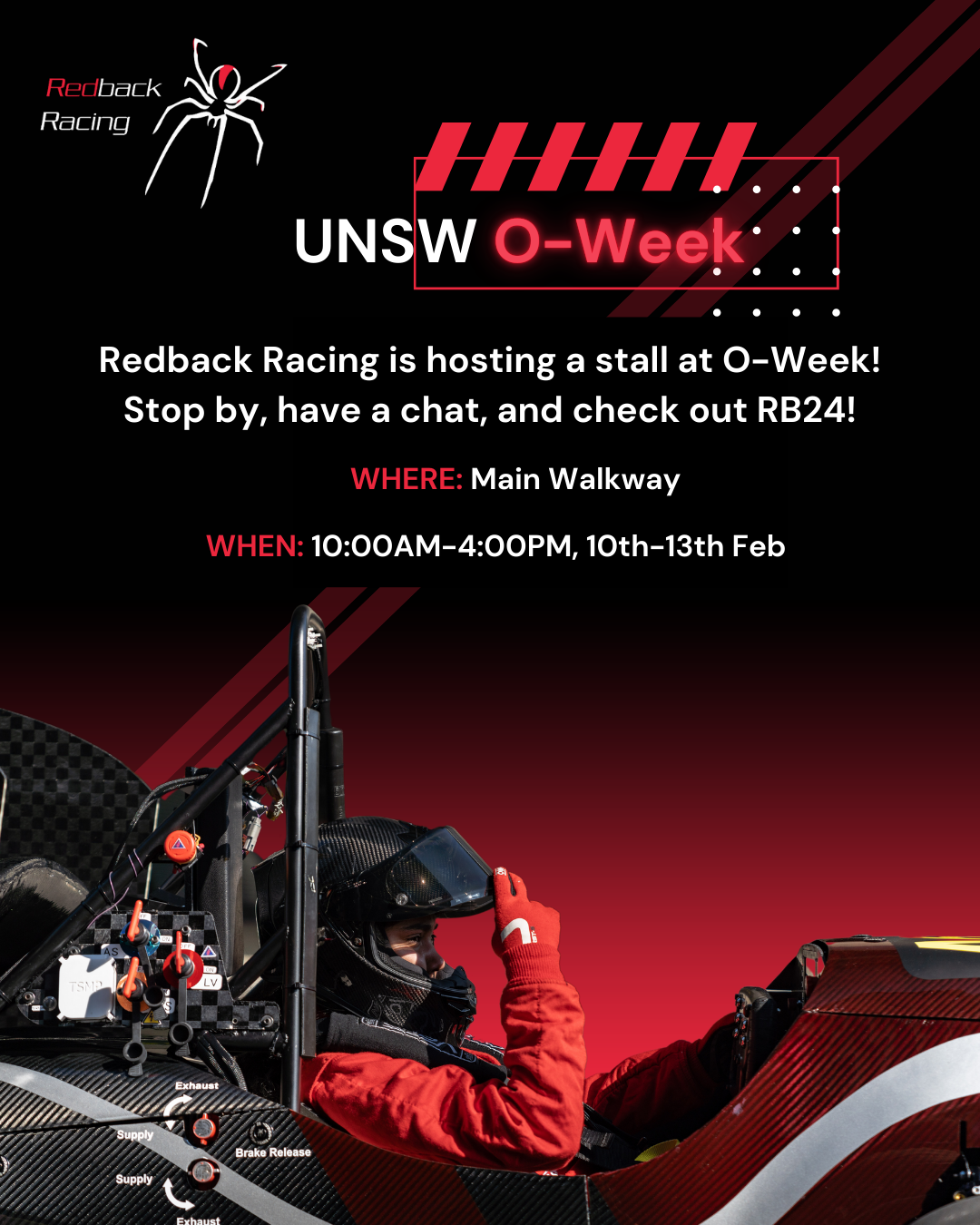
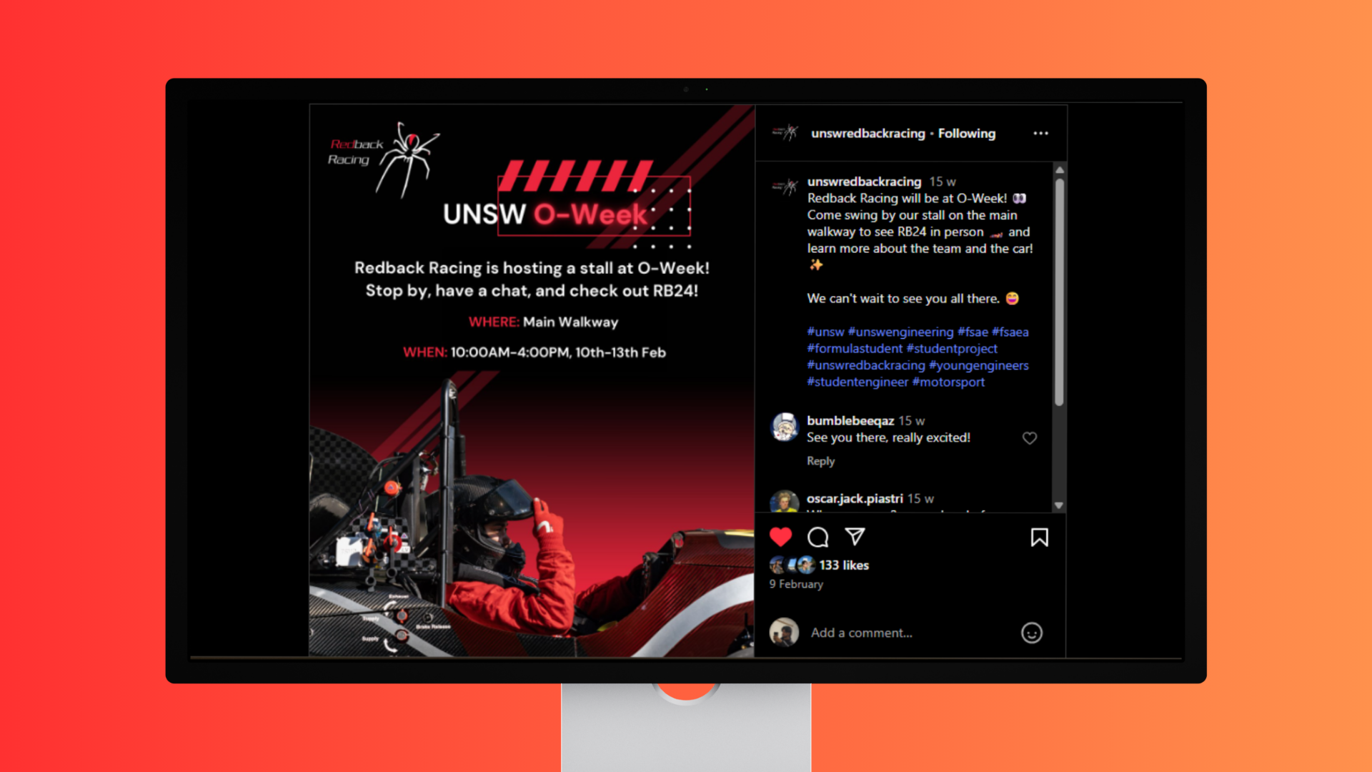
UNSW Redback Racing - O Week Social Media Marketing Post
February 2025
This poster was crafted to draw attention to Redback Racing’s O-Week stall, using bold contrasts and neon-inspired accents to stand out in a busy campus setting. The integration of the RB24 car image adds energy and authenticity, while the structured layout ensures key event details (where, when, what) are clear at a glance. The design balances excitement with professionalism, encouraging engagement from both prospective members and curious passers-by.
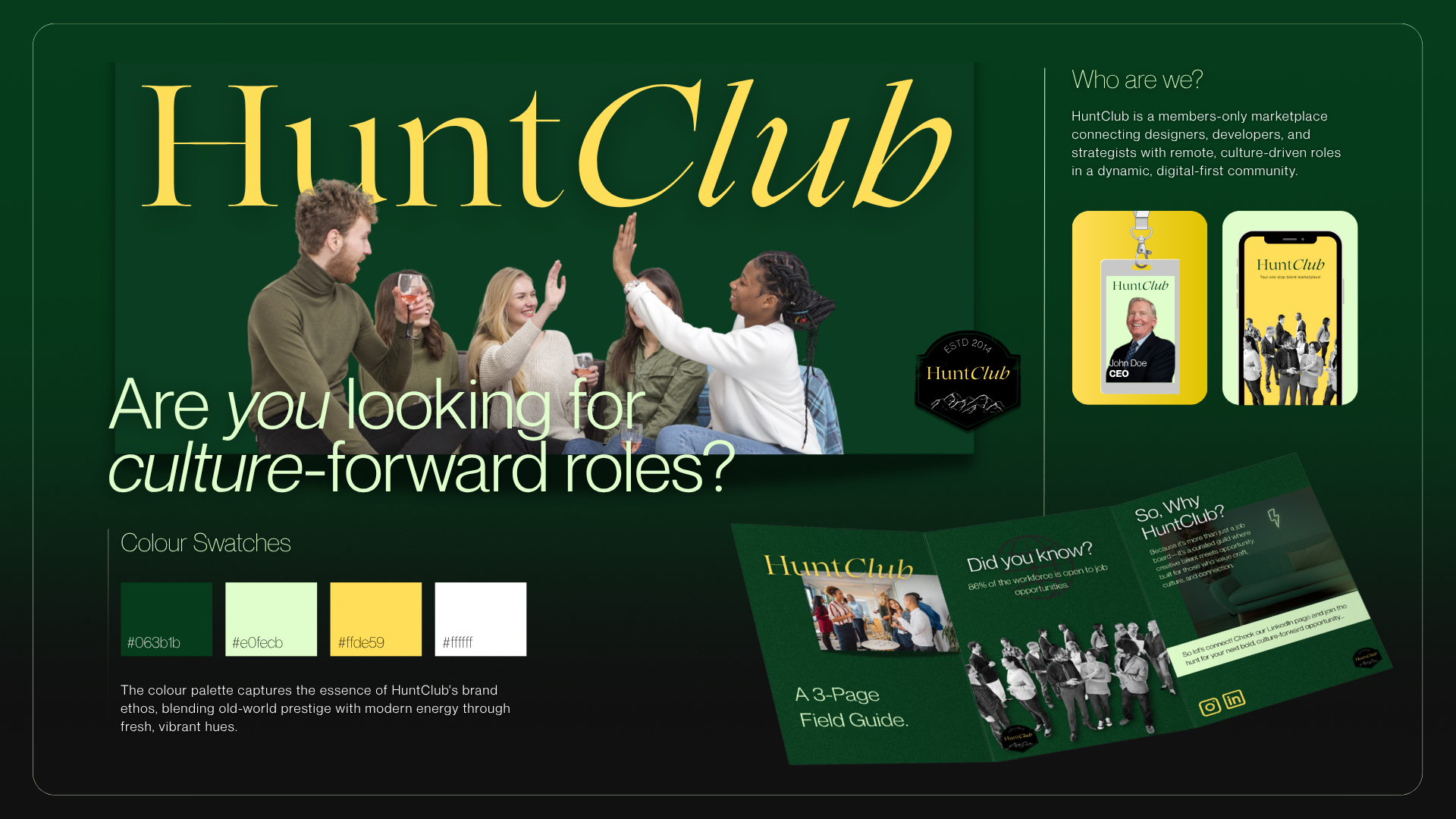
Refract - 24 Hour Design Challenge
July 2025
Refract is a design agency based in Sydney, being a bespoke engine for allowing businesses to thrive. They conducted a 24-hour Design Challenge. This experience taught me how to rapidly iterate designs under time pressure, balance creativity with efficiency, and deliver a polished outcome against a challenging brief. Our brief was to design a branding solution for a fictional hiring agency and marketplace titled Hunt Club. Working through research, concept development, sketching, and execution through InDesign in such a short timeframe, I strengthened my adaptability, reinforcing the value of testing ideas quickly. It was a formative experience that sharpened my branding and graphic design skills while simulating real-world client expectations.
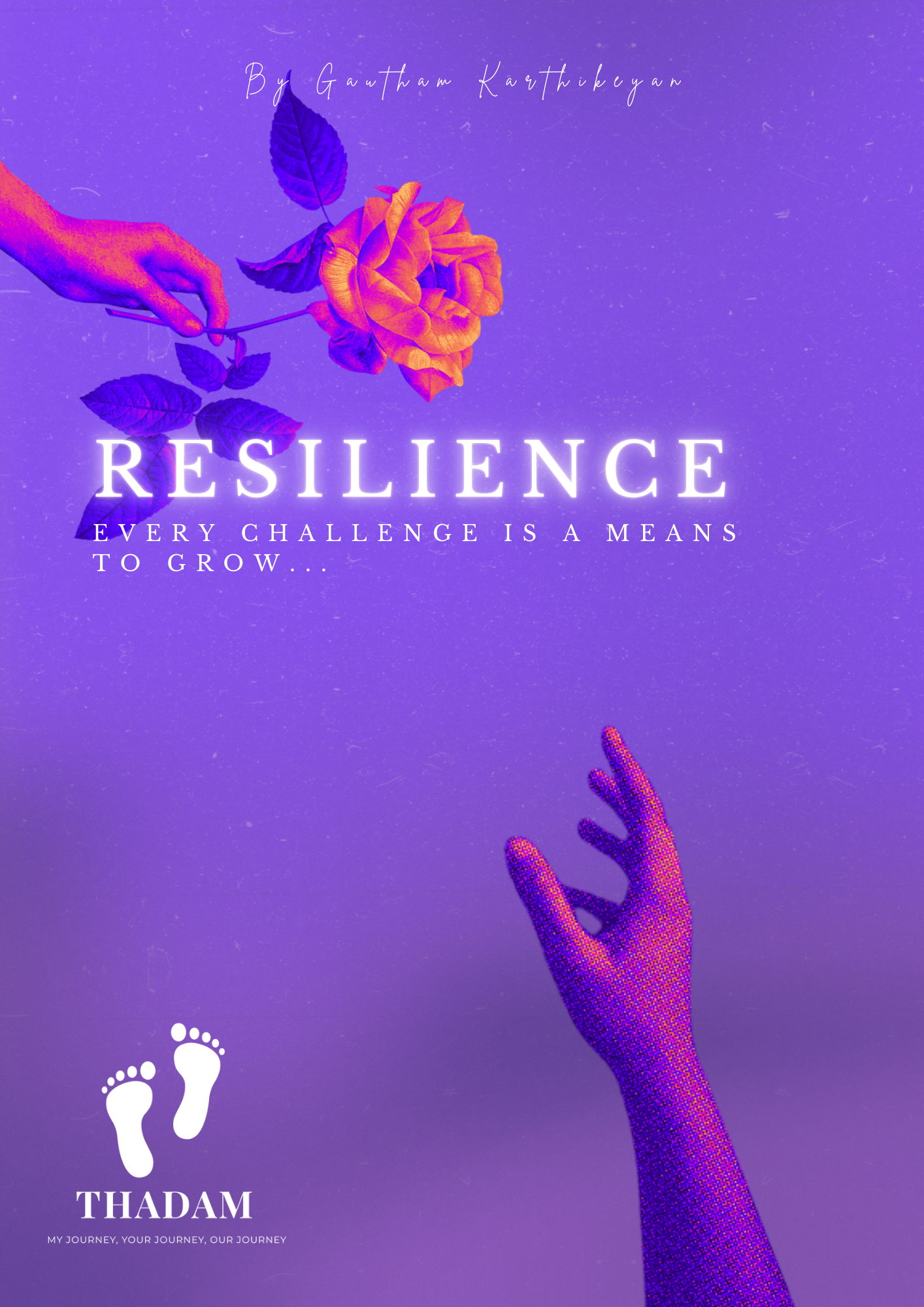
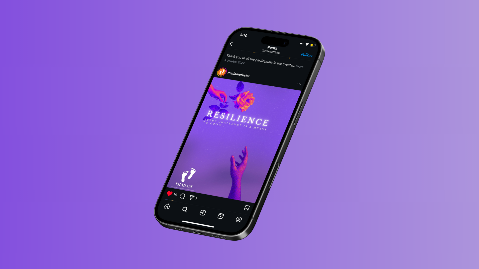
Resilience Poster Design
August 2024
This is a poster I designed for Thadam’s Create & Connect competition, themed 'Resilience'. Thadam (which means “journey” in the Tamil language) is a volunteer-led NGO founded in 2021, aimed at promoting mental health awareness and breaking stigma in the South Asian community across Australia. Created using Adobe Illustrator and Photoshop, my design was awarded 4th place. The piece uses my photographed arm with halftone effects, a rich purple palette, and symbolic florals to evoke strength, healing, and the importance of support networks.
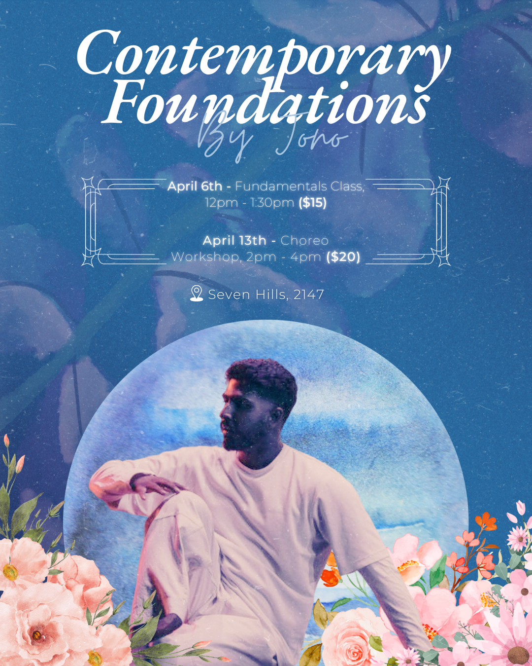
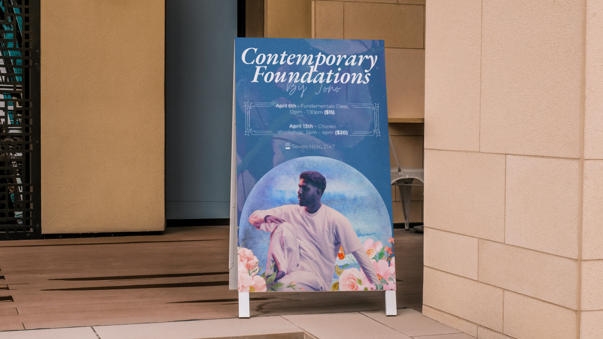
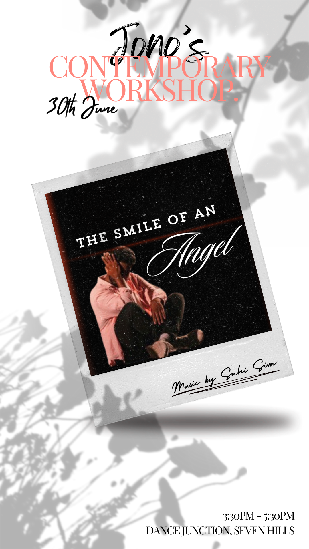
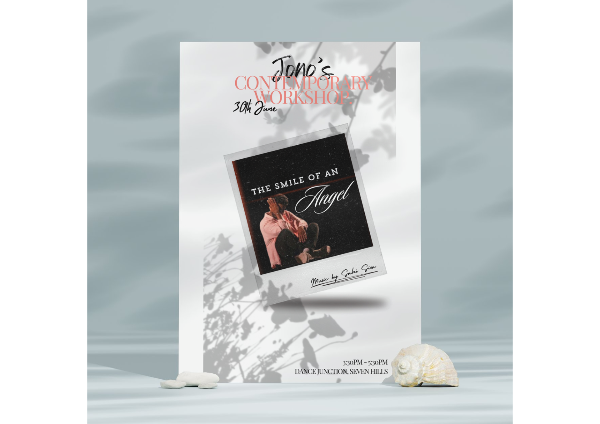
Promotional Workshop Poster Design
March 2025
Upon being impressed by my earlier marketing work for his dance workshop last year, this client approached me again for another design. This promotional poster was created for a two-part dance workshop series held in April. The design captures the artistic essence of contemporary dance by combining soft floral elements and dreamy textures with a striking portrait of the instructor. Set against a celestial-inspired blue moon background, the layout features elegant serif and handwritten fonts that reflect the expressive and fluid nature of the dance style.
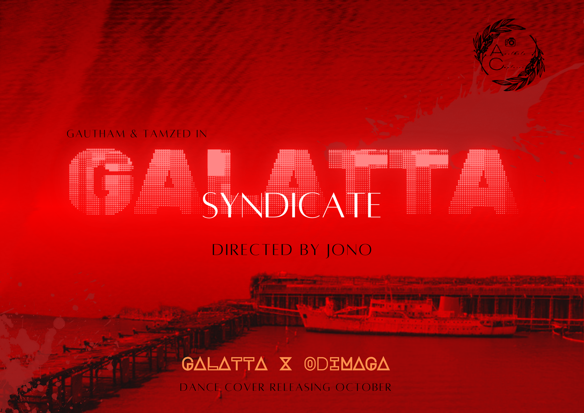
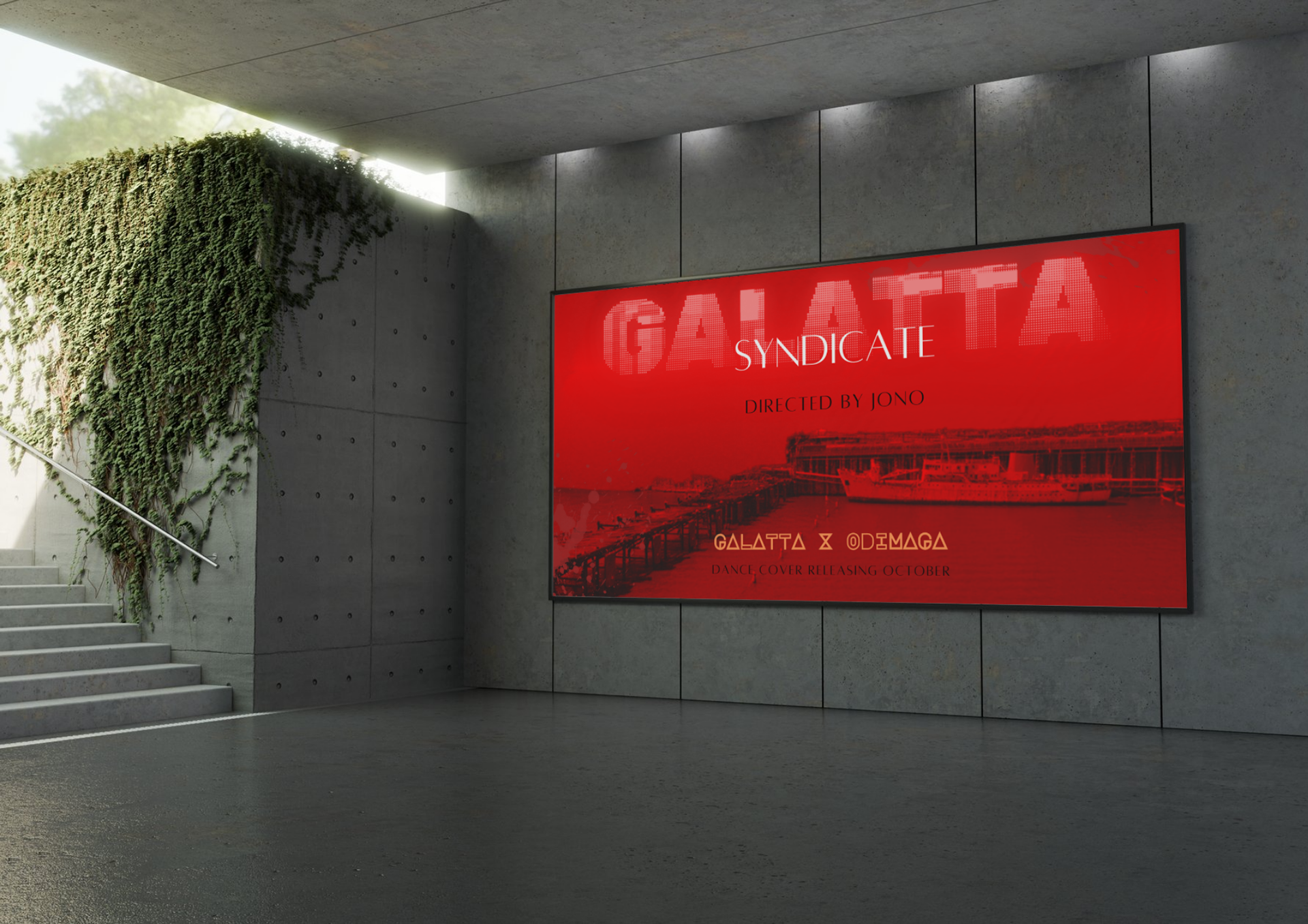
Promotional Poster Design - Aesthete Captures Production
August 2024
Being a part of a large music video production crew, I was hired to create a promotional poster design. I used strong red hues to convey the intensity of the overall concept and mixed different textures to create a subtle yet sombre atmosphere for the poster. The visual hierarchy consists of the videography company's logo, followed by the main title of the project and other details. In terms of typography, I layered two sans-serif fonts to create a modern, yet timeless depiction of the core content.
Promotional Workshop Poster Design
June 2024
A client approached me to design a promotional poster for their upcoming contemporary dance workshop. I began work once understanding the tonality of the workshop itself. With its soft colours, shadows, and elegant cursive writing, along with its playful, modern aesthetic, the poster design exudes a light-hearted vibe.