
Overview
I was hired by Realrun for a 3-month contract Product Designer role when usability issues and high drop-off rates had started to accumulate across their SaaS-powered platform. My main task was to redesign their entire UI system, refine key user flows to reduce friction, and support business growth.

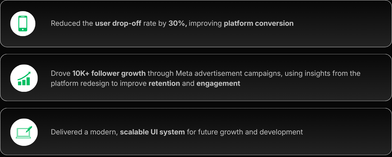
The Impact
» Elevating the real estate marketing experience.
To begin with, what is Realrun?
» A PropTech platform used by over 1,900+ real estate agencies and 10,000+ verified distributors.
RealRun transforms the old-school flyer distribution process into an efficient, tech-powered system for real estate agencies. Distributors collect marketing materials from agencies and deliver them to specified locations, bringing digital precision to physical ads, making the process transparent, measurable, and reliable.

The Problem
» Core usability issues where the user experience broke down in the old design.
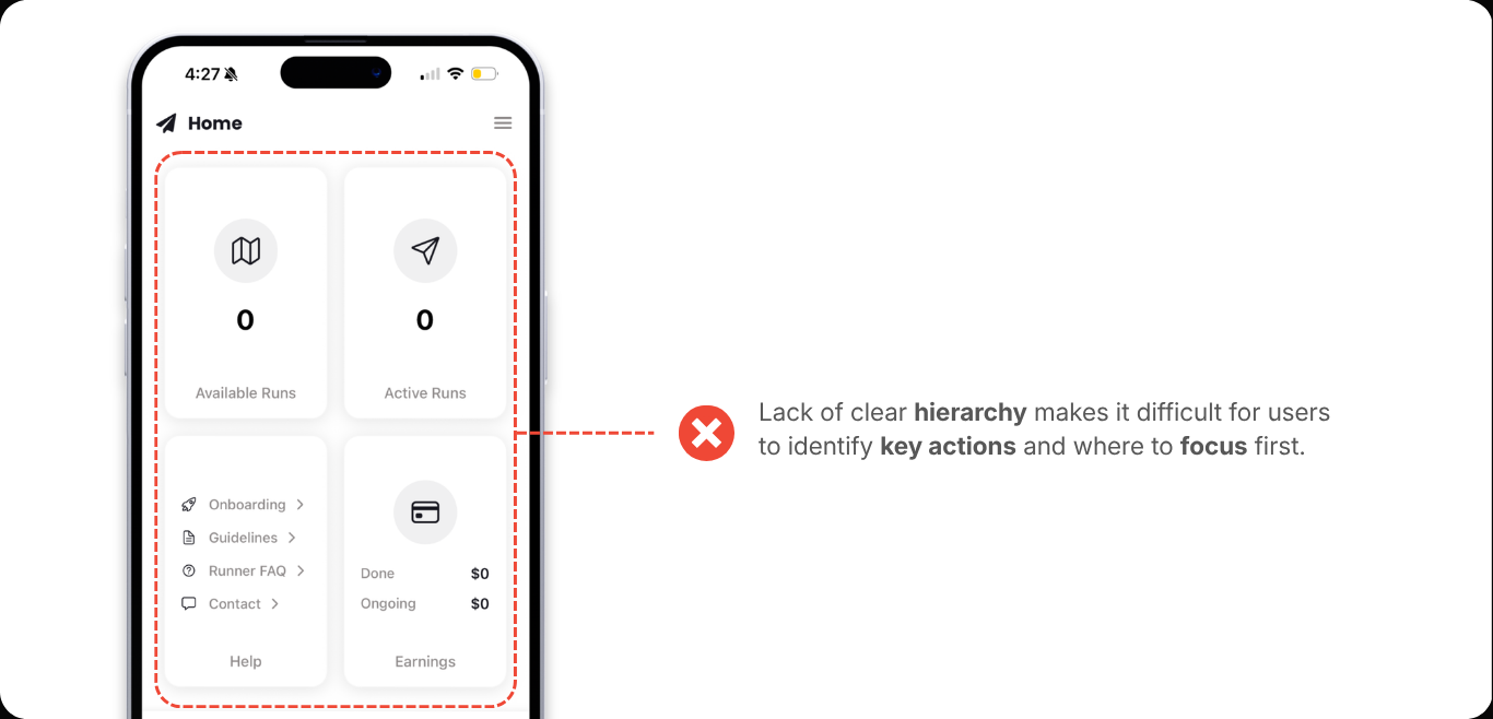
① Home Screen
Key actions are buried within equal-weight cards, making it unclear where users should focus first. The lack of hierarchy and prioritisation slows down decision-making and reduces engagement with core actions.
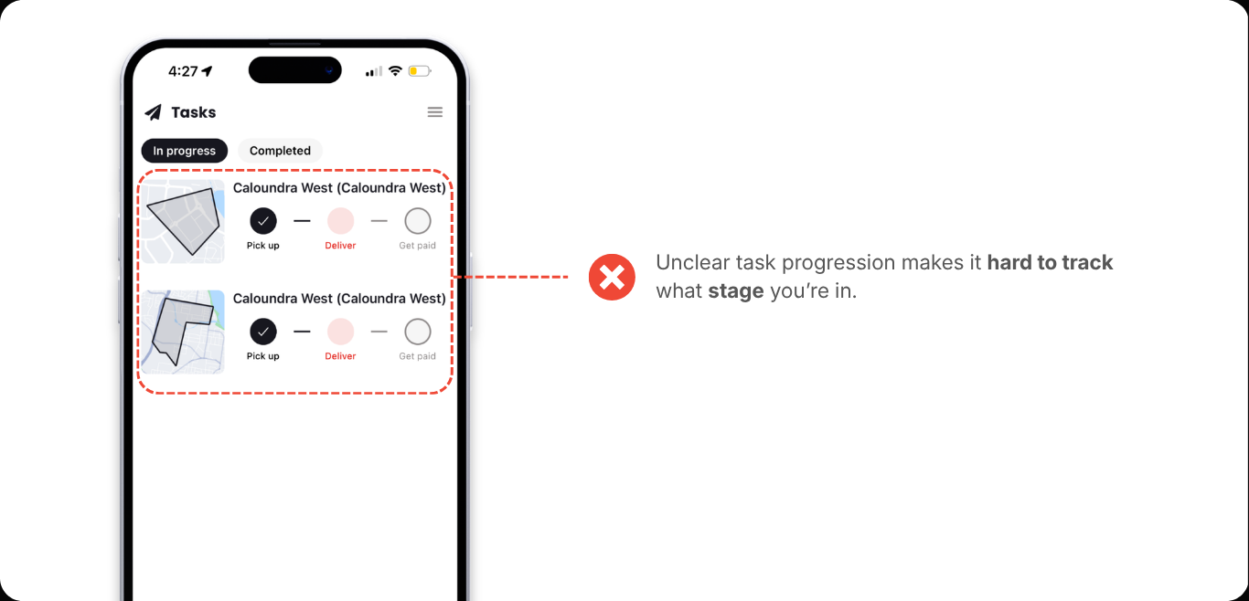
② Tasks Screen
The task flow lacks clarity, with status indicators and progression steps not immediately intuitive to understand. Users have to mentally interpret what stage they’re in, increasing friction during active task completion.
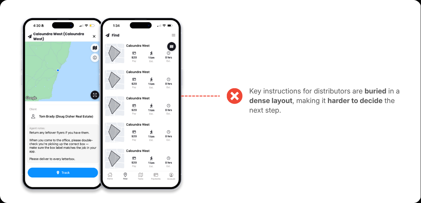
③ Distribution Details UI
Critical task information is buried within long text blocks, forcing users to search for key instructions while on the move. The layout doesn’t prioritise actionable elements, reducing efficiency during real-world execution.
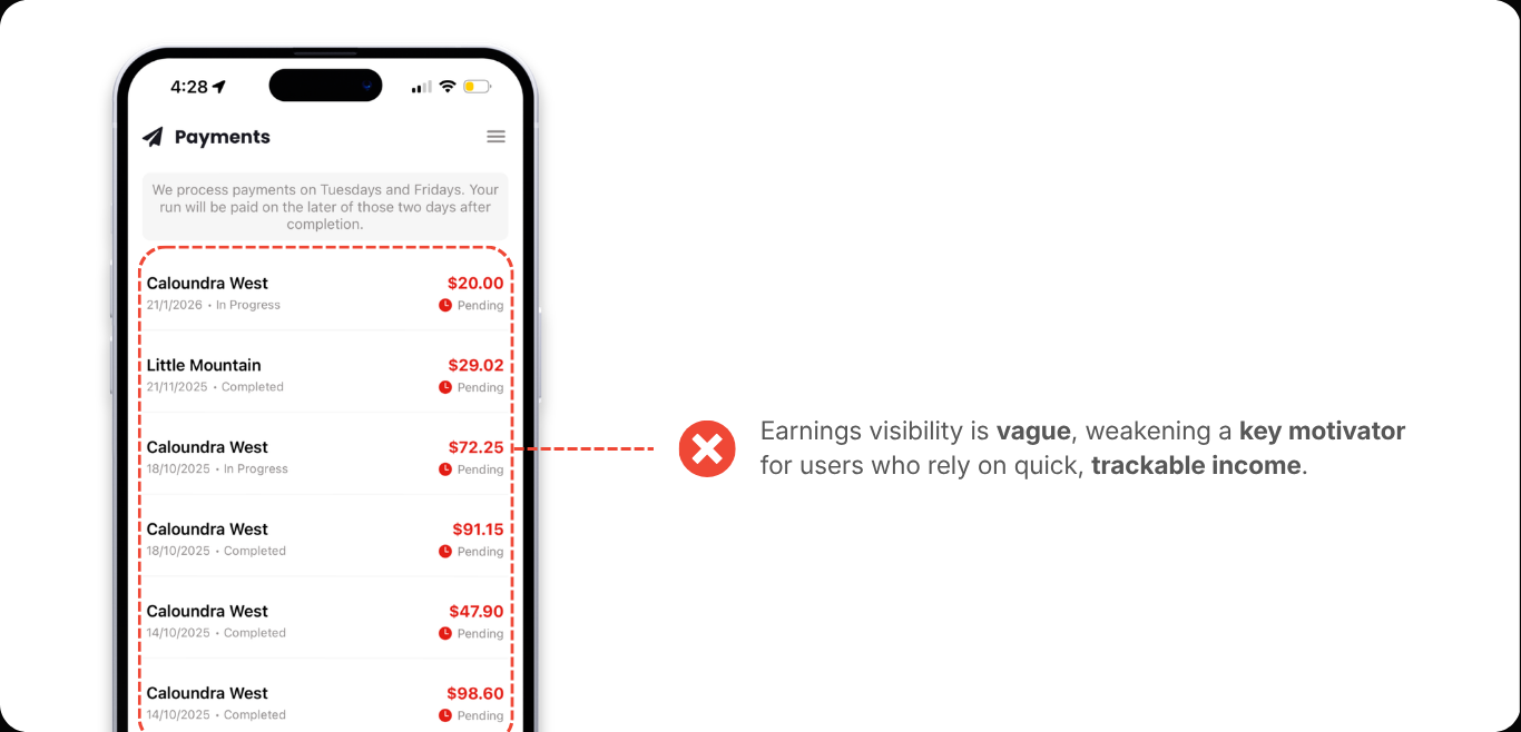
④ Payments Screen
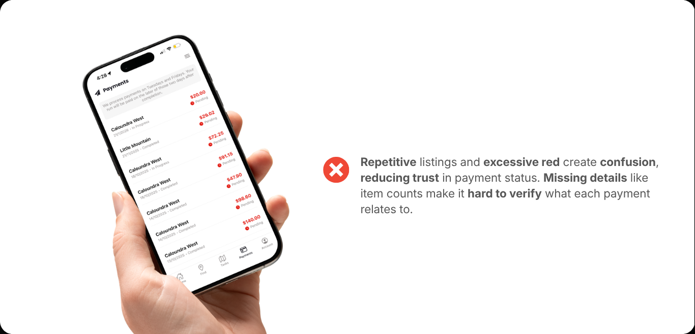
Earnings are a core motivator for users, yet the layout makes it difficult to quickly understand payment status and track income. This weakens a key selling point of the platform, as users expect fast, clear visibility into what they’ve earned and what’s coming next.
The Solution - a glimpse
Over a 3-month redesign, I brought both sides of the platform, flyer distributors and real estate agencies, into one streamlined experience. Working closely with operations and sales, I dug into user behaviour and paired those insights with heuristic reviews to uncover and fix the core usability gaps.
[Research]
A Deep Dive...
To uncover the catalyst behind the friction points, I worked closely with the sales and operations teams through a series of focused meetings. These conversations helped me piece together key pressures across the platform, shaping a coherent direction to work with.
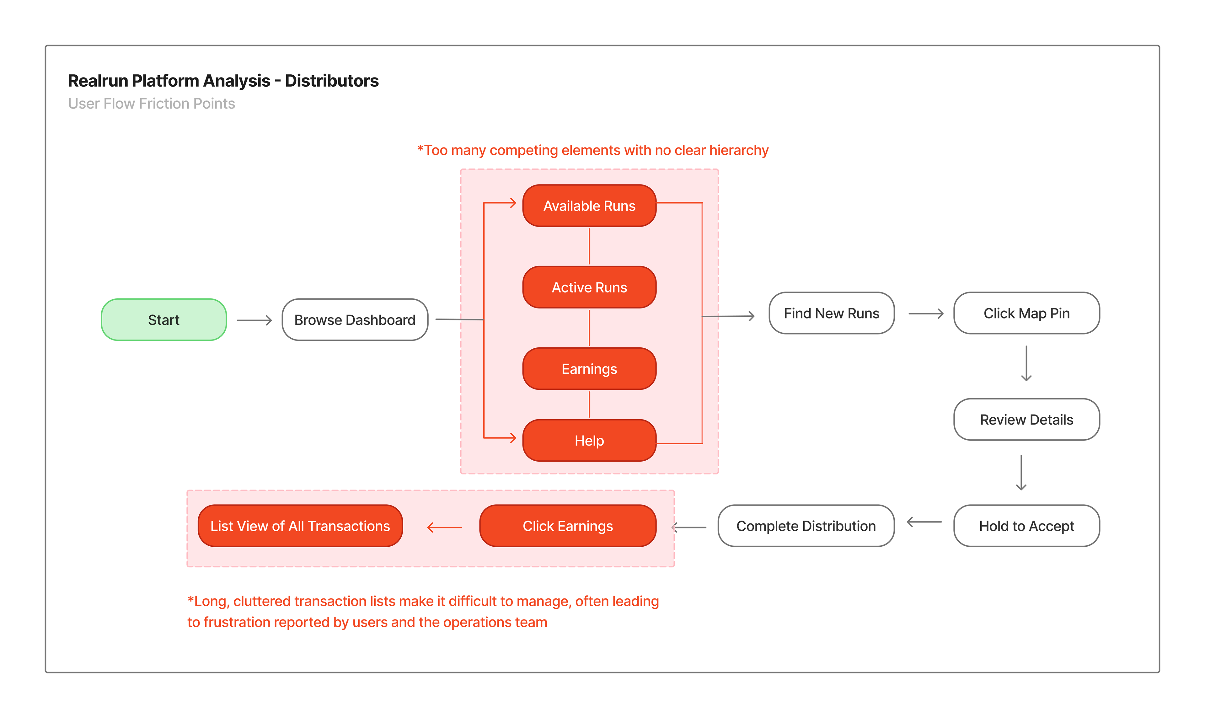
» I kicked research off with a simplistic user flow, spotting issues immediately!
» Next, it was time for meetings with the operations team...
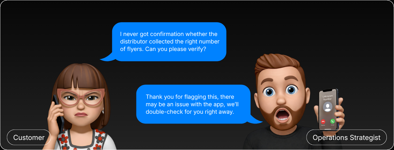
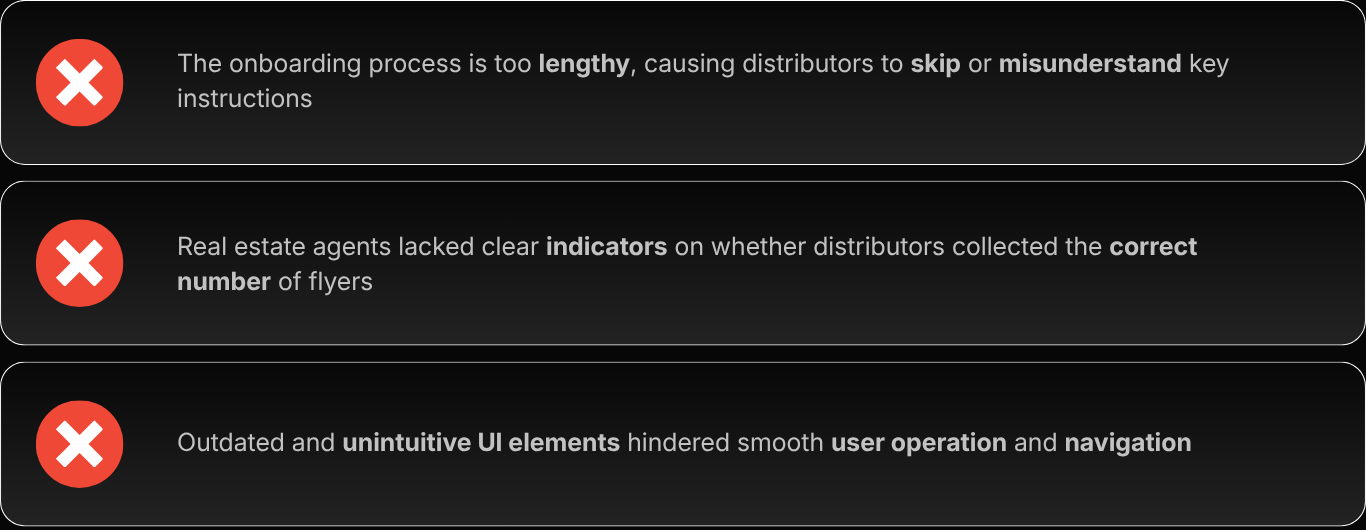
Through internal stakeholder meetings, I learnt there was no clear way for agents to verify flyer quantities, while onboarding gaps left users unsure what to do, causing delays. On top of that, a cluttered, jumbled UI made the platform harder to navigate, leading to a high user drop-off rate.
» From there, I spoke with the sales team to surface the issues from their side
Sales flagged that prospects struggled to see clear ROI (Return On Investment), making conversion harder, slowing deal cycles. Distributors also faced confusion around the transactions page, leaving them unsure if their payments are going to be received on time. They found the endless list UI overwhelming.
» Here's a visual breakdown of what Realrun is facing
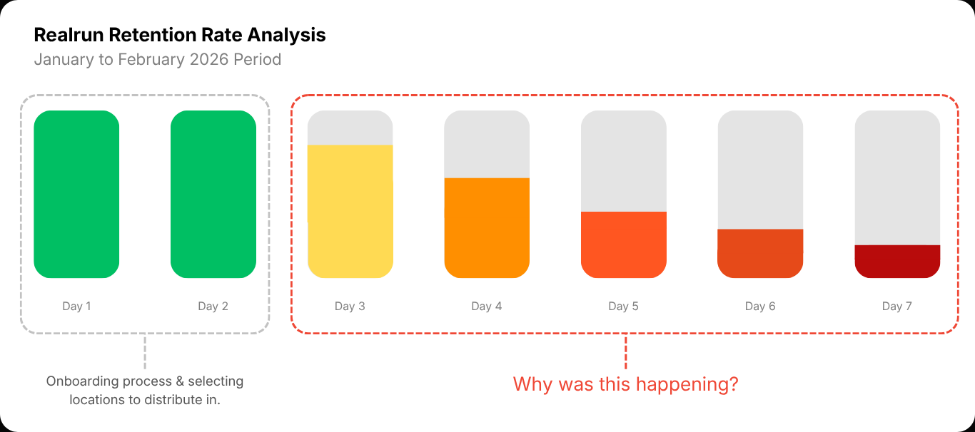
Moving forward, I used Notion to document the scope of the user drop-off rate I intended to measure. By collaborating with the operations team, I measured usability with a sample of 130 distributors, identifying where and why distributors were losing momentum and how long it took for them to disengage with the current app.
[Opportunities for Improvement]
Pinpointing the factors driving user drop-offs
The typical process for users to select a distribution location and complete their task takes a maximum of 7 days, with another 7 days required to process payments. There were 3 critical bottlenecks that disrupted the user flow within 1 week of using the platform.
The Final Outcome
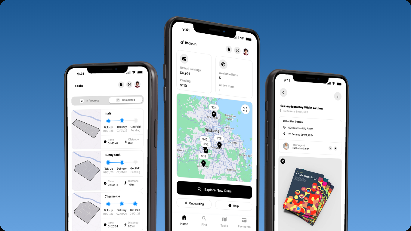
» Here's the distributor side of the platform first...
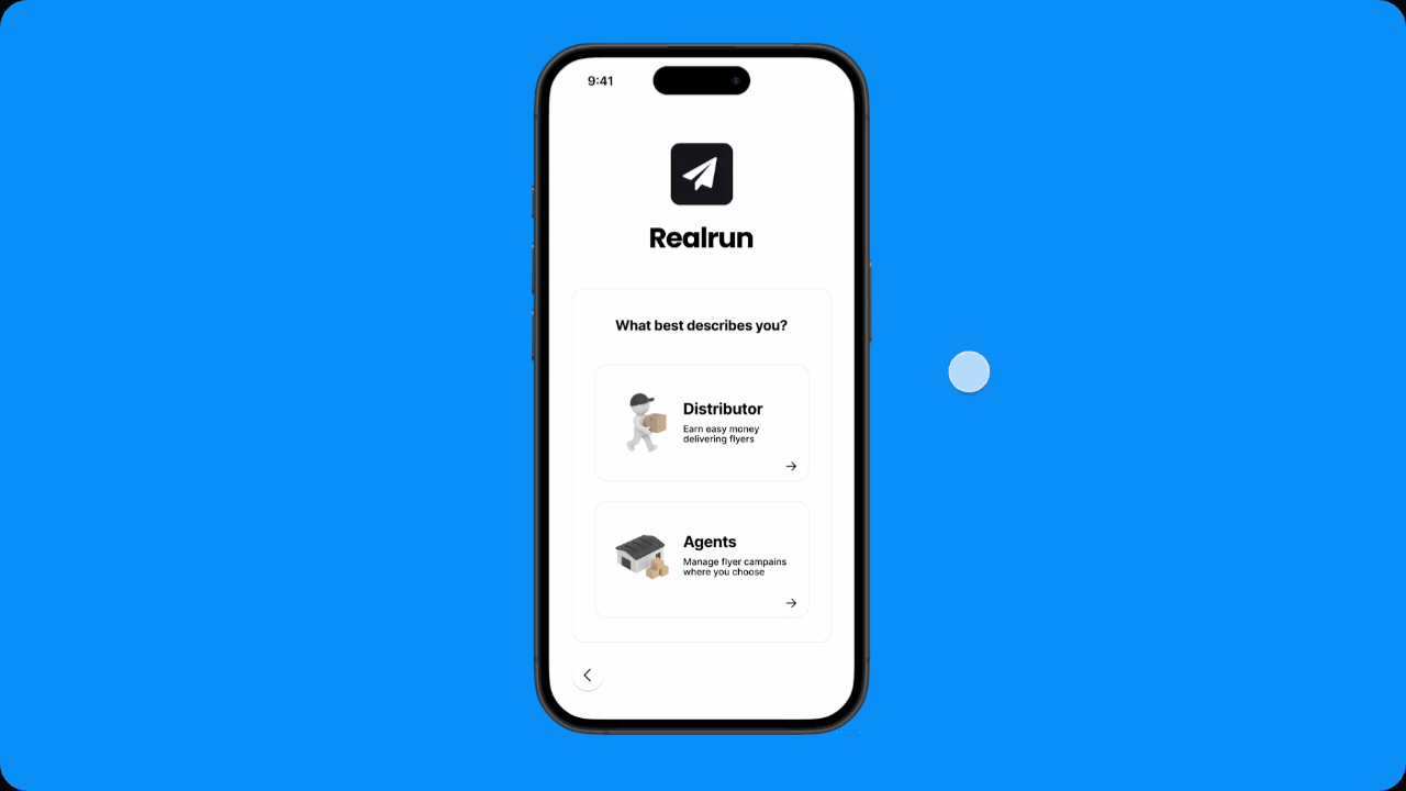
01 A Simplified Onboarding Screen.
The research up to this point revealed a clear picture of where users faced the most challenges on the RealRun platform. The redesigned onboarding with a clear feedback system creates a smoother, more trustworthy entry point that doesn't have any roadblocks for the users.
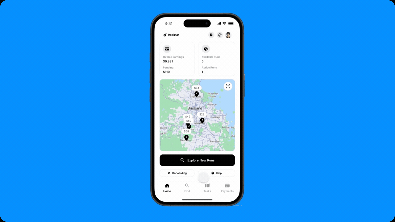
02 Clarity in Dashboard Navigation & Task Selection.
The redesigned dashboard introduces a clearer hierarchy, making it easier for users to understand where to focus and what to do next. By simplifying task discovery and reducing visual clutter, users can quickly find and act on opportunities with less effort.
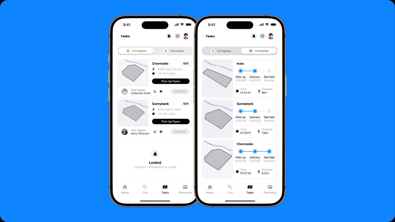
03 Tasks — Pick Faster, Move Quicker.
The updated tasks screen is built for speed, letting users quickly spot the right runs and act without overthinking, rectifying a core pain point. Key details are front and centre, so decisions feel instant rather than effortful.
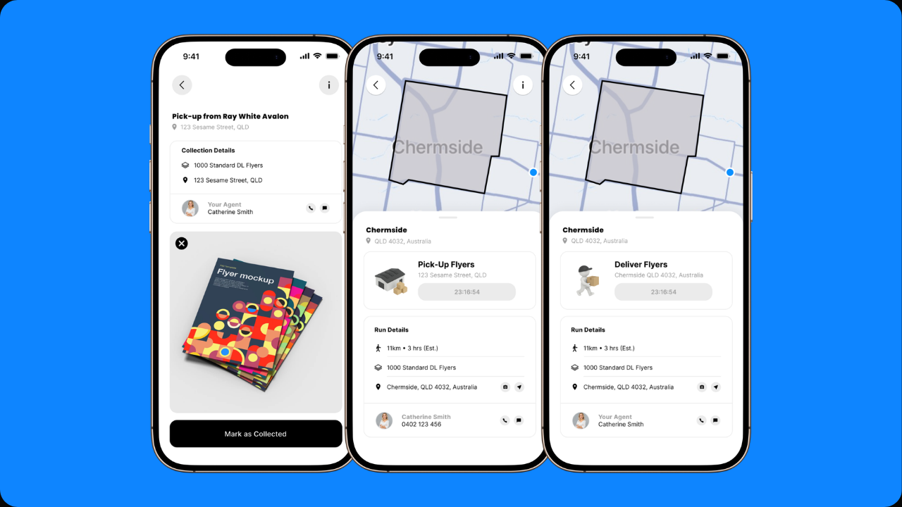
04 Flyer Pick-ups & Timers — No Guesswork, But a Clear Flow.
The flyer pick-up UI clearly shows what to collect, where to go, and who to contact, all in one place. With key details surfaced upfront, users can collect materials confidently, while clear timeframes keep deliveries on track and payments on time.
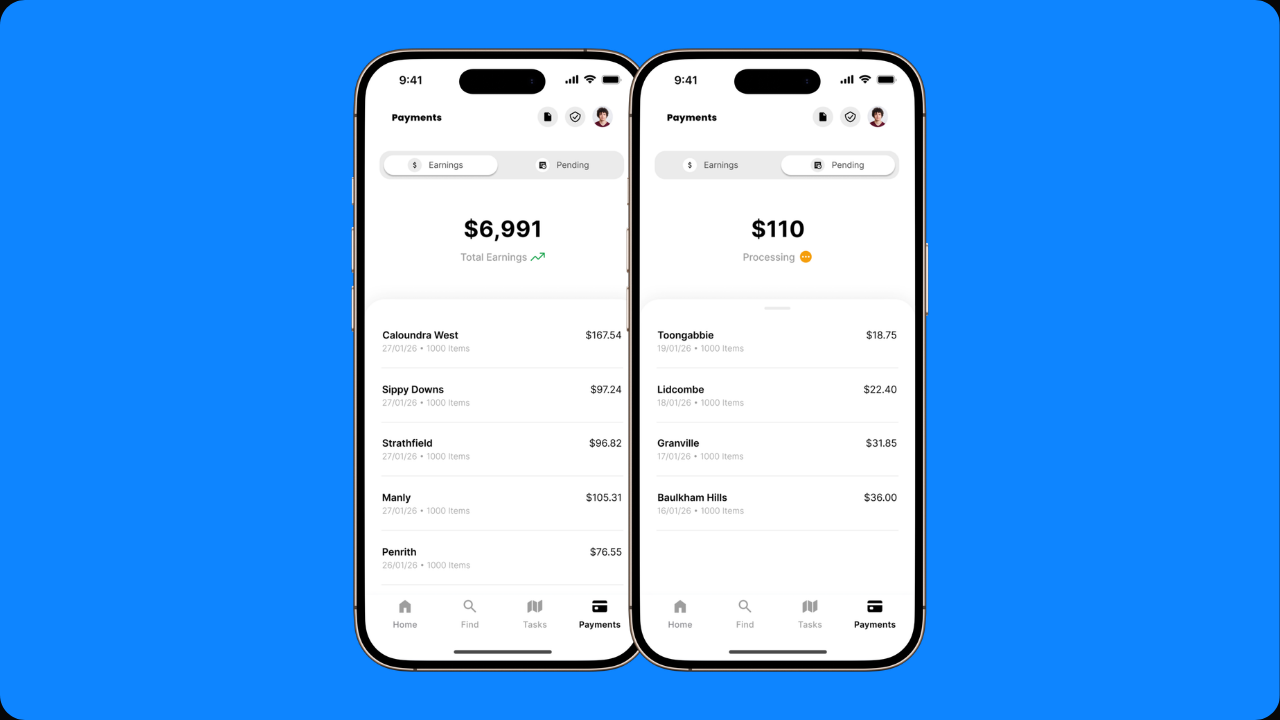
05 Earnings, Made More Legible and Motivating.
The financial section gives users instant visibility on what they’ve earned and what’s on the way, turning income into something tangible and trackable. By separating earnings and pending payments, users can quickly understand their progress and stay motivated to complete more runs.
» Now, from the real estate agent's lens...
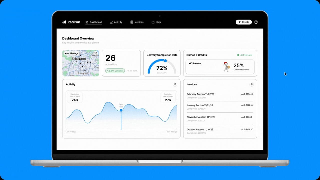
01 Dashboard & Activity Overview — Track Performance, Take Action.
Real estate agents are given a clear snapshot of campaign performance, active runs, and key metrics at a glance. By combining insights with actionable data, agents can quickly oversee distributor performance and make informed decisions without having to dig through multiple screens.
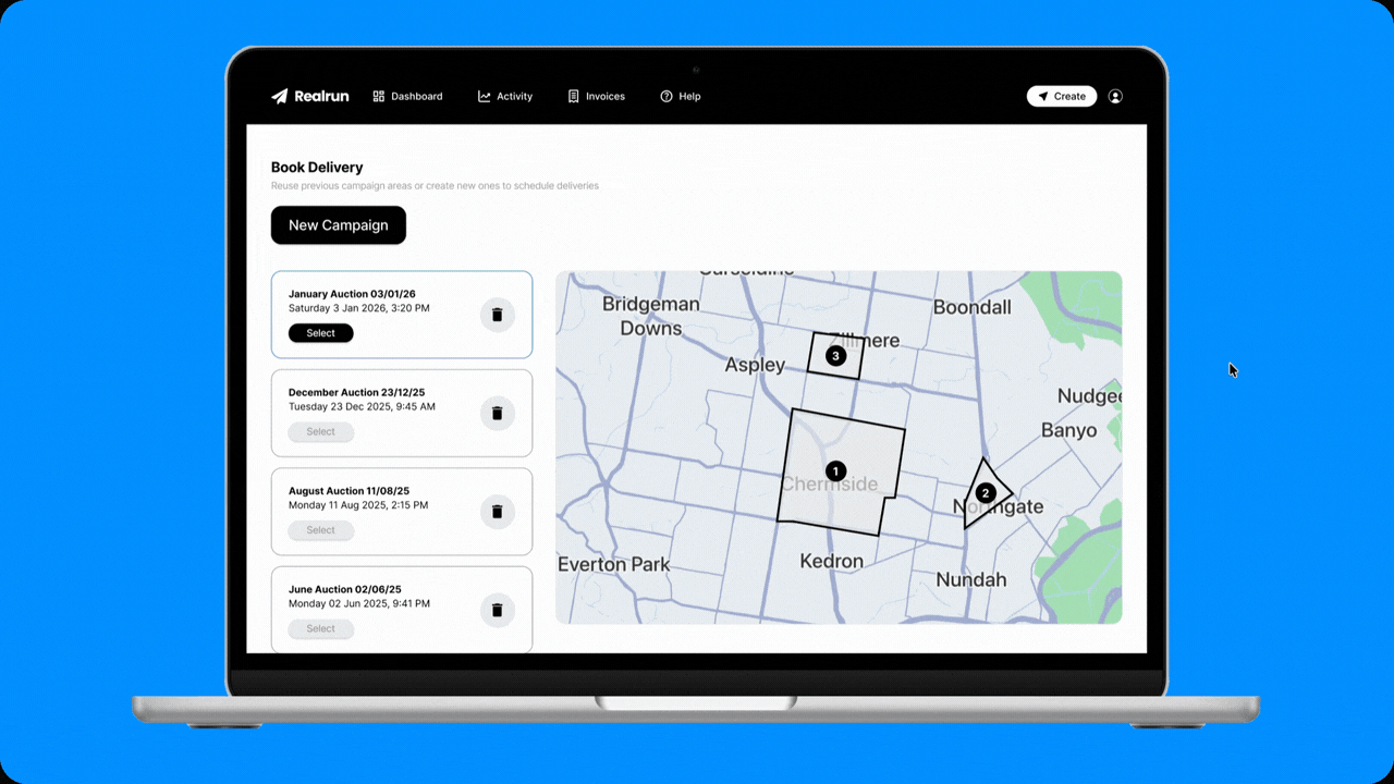
02 A New Marketing Campaign at the Tip of Your Fingers!
Starting a new campaign is now streamlined, allowing agents to select areas and launch deliveries without unnecessary steps. With a structured map and campaign list, agents can plan with confidence and stay in control of their marketing from the very beginning.
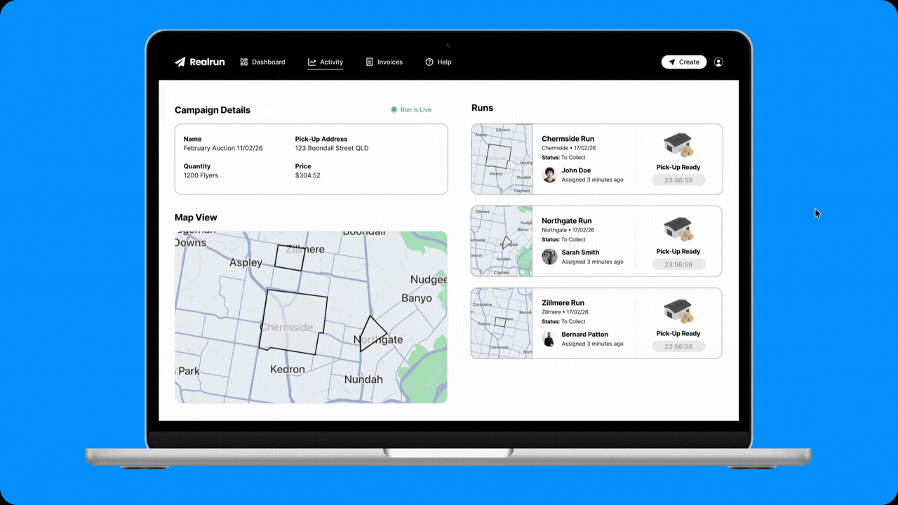
03 Run Details & Invoice Management.
Agents can now keep a close eye on every run while having invoices neatly organised in one place. By tying delivery progress directly to payments, the experience gives agents a smoother, more controlled way to manage their campaigns end to end.
[Retrospective]
Learnings & Key Takeaways
Looking back, the biggest shift came from directly communicating with internal stakeholders and focusing on real user behaviour rather than assumptions. This helped exposed where the experience was quietly breaking down. By addressing those moments and aligning both sides of the platform, the redesign became more intentional and outcome-driven.
This project reinforced that meaningful impact comes from solving the right problems, not just improving visuals. When user needs and business goals are aligned, the experience naturally becomes clearer, more effective, and easier to use.