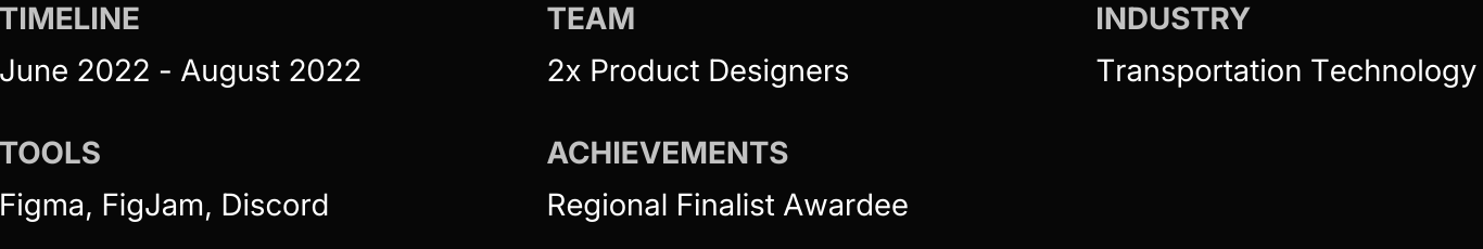
Overview
Transit Guard is a safety focused mobility dashboard designed to improve ride share transparency, awareness, and user protection, developed as part of the Uber Global Hackathon in 2022 to address real world rider and driver safety challenges.
Although this project was my very first UX project, it received a Regional Finalist Certificate, marking an early milestone in my design journey.

To begin with, what is Uber Global Hackathon?
The Uber Global Hackathon is a design competition for young creatives, where teams showcase work based on their fast-paced iterations and rapid developments of ideas. I had the privilege of designing in the UX Design & Product Development Category, presenting an innovative solution for a real-world challenge. The timeframe of this project was 48-hours.
My team member and I competed against over 732 teams and more than 1,800 competitors from 68 different countries. It was an incredible opportunity to collaborate, learn, and push the boundaries of innovation.

The Brief
For the 2022 Uber Global Hackathon, teams were challenged to use Uber’s API to rapidly prototype a real world solution within 48 hours. I focused on ride share challenges around safety, efficiency, and accessibility, designing a concept aimed at improving trust, streamlining the experience, and supporting more equitable service delivery.

The Problem
» Ride share services often fragment trust and safety, leaving both riders and drivers feeling vulnerable instead of protected and confident.
Ride-share services face challenges with security, fraud, and driver safety. Passengers struggle to verify drivers’ identities, raising concerns about safety and fraud, while drivers risk interacting with intoxicated or unsafe passengers. These issues undermine trust and the overall experience for both riders and drivers.

The Solution
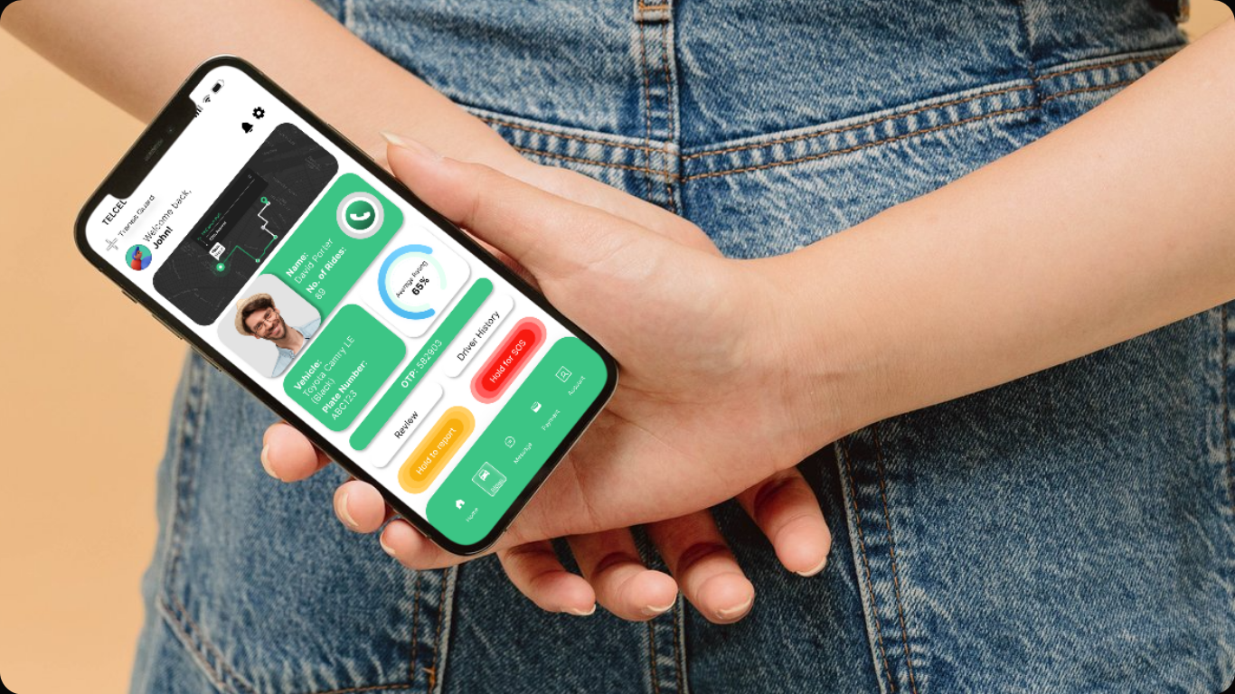
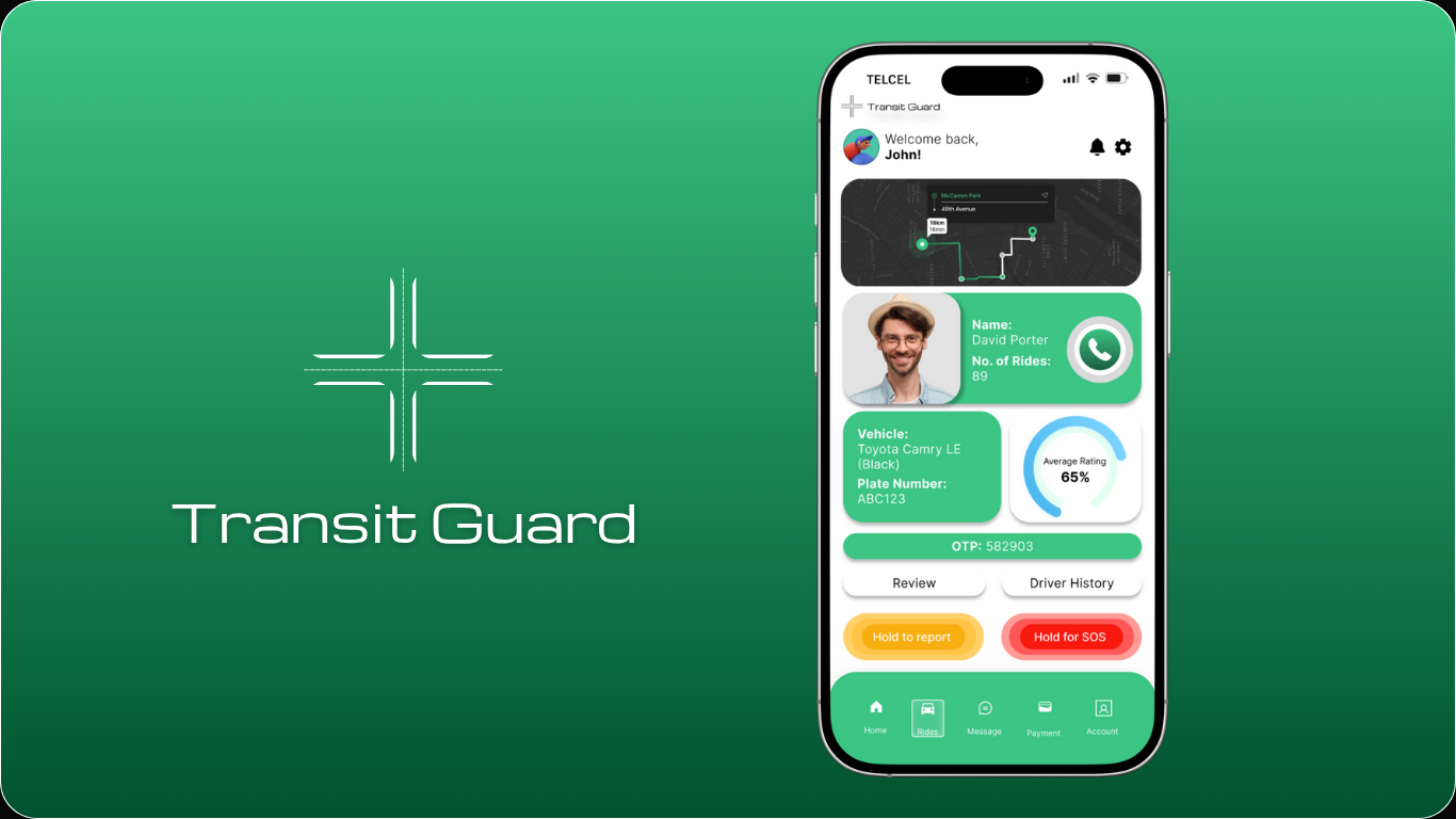
Imagine a screen that consolidates OTP verification, driver and car details, ride information, and easy access to safety options. Transit Guard ensures safety at all times, with quick options for reporting and sending SOS alerts, no matter where the user is.
Imagine a screen that consolidates OTP verification, driver and car details, ride information, and easy access to safety options. Transit Guard ensures safety at all times, with quick options for reporting and sending SOS alerts, no matter where the user is.
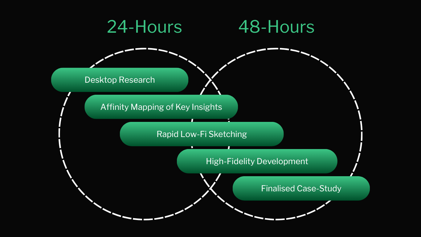
The design process at a glance...
The process was divided into two stages due to the 48-hour timeline. The first day focused on key research that was consolidated into an affinity map before low-fidelity sketches. The second day was dedicated to high-fidelity development and finalizing the case study. This approach ensured efficient progress from ideation to completion within the 48-hour competition window.
The process was divided into two stages due to the 48-hour timeline. The first day focused on key research that was consolidated into an affinity map before low-fidelity sketches. The second day was dedicated to high-fidelity development and finalizing the case study. This approach ensured efficient progress from ideation to completion within the 48-hour competition window.
[Affinity Mapping]
Desktop Research - Key Findings
I started my design process with a detailed study of the problem area. I used the affinity mapping technique to organize insights from popular news platforms, like ABC, The Courier Mail, and The Guardian. I aimed to identify key patterns in ride-share fraud, safety, and overcharging issues. By mapping related findings, I highlighted recurring problems, enabling a focus on user pain points which would uncover actionable insights to drive the solution design.
I started my design process with a detailed study of the problem area. I used the affinity mapping technique to organize insights from popular news platforms, like ABC, The Courier Mail, and The Guardian. I aimed to identify key patterns in ride-share fraud, safety, and overcharging issues. By mapping related findings, I highlighted recurring problems, enabling a focus on user pain points which would uncover actionable insights to drive the solution design.
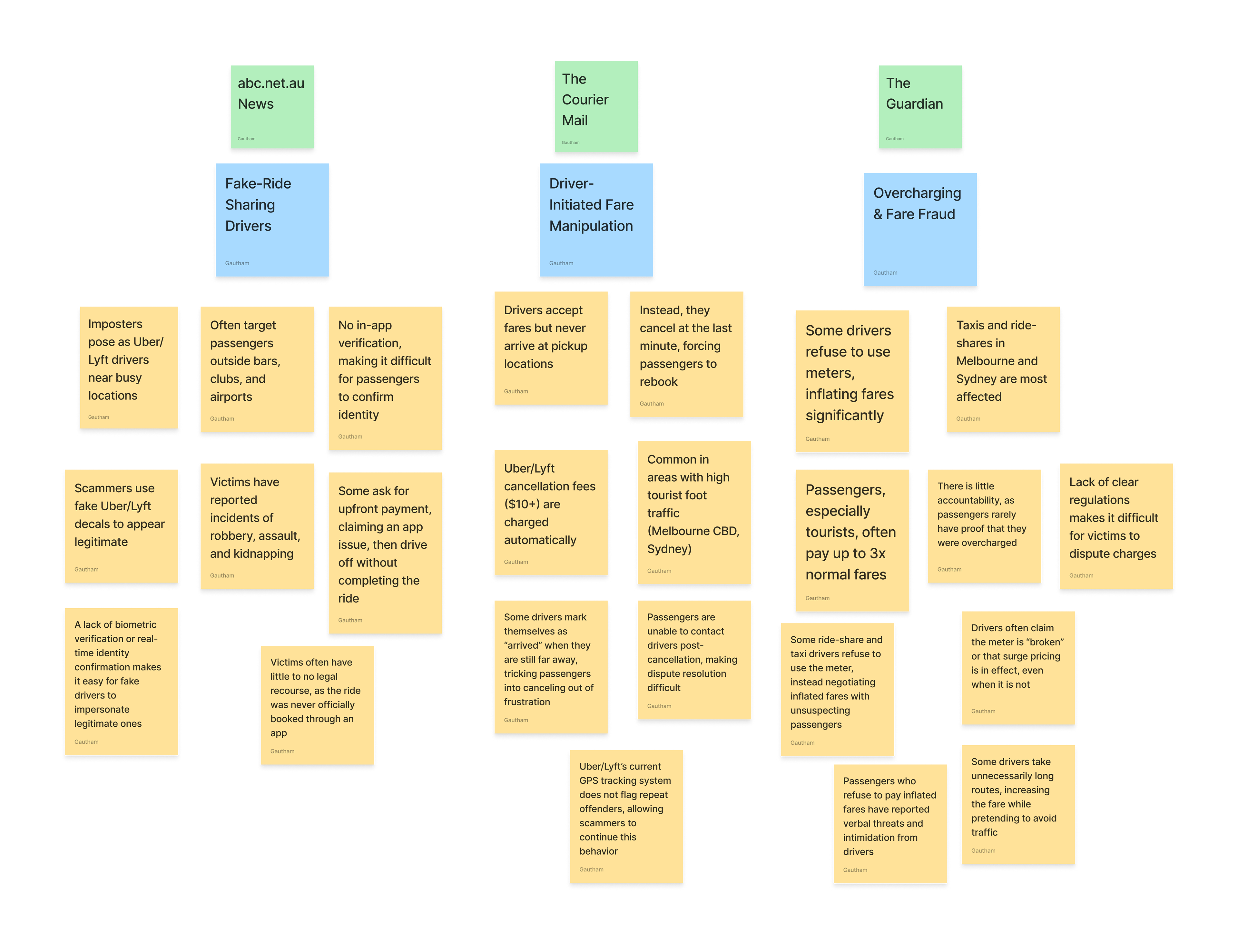
What did the research reveal?...
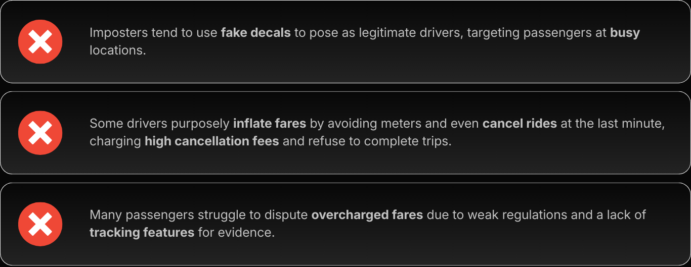
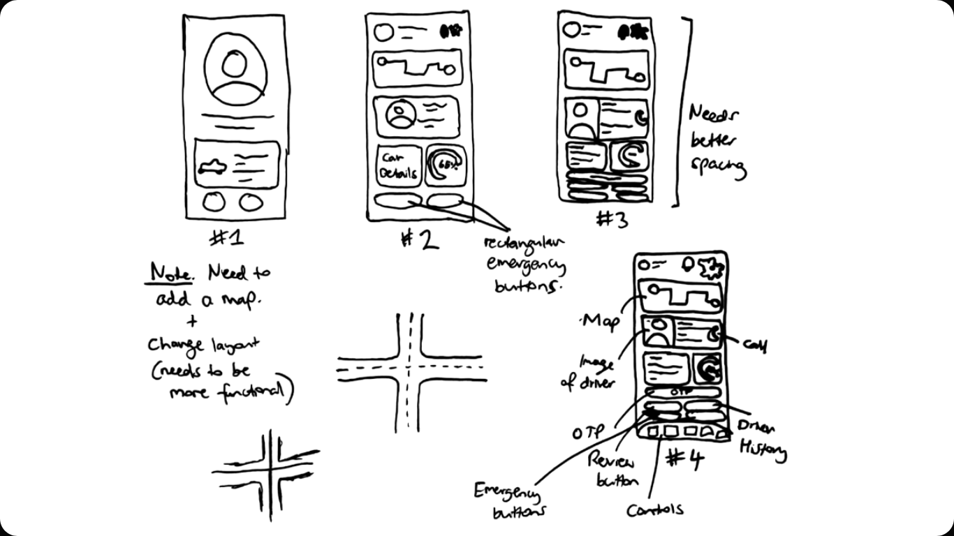
Iteration
Sketching moved fast and iteratively, with low fidelity concepts developed in the latter half of the first 24 hours following research. Early sketches were cluttered and lacked context, prompting the introduction of a map and clearer structure. Subsequent iterations added accessible emergency buttons, driver details, and OTP verification, before finalising a layout that prioritised readability and quick access to critical safety features, especially in high risk situations.
The Final Outcome
Designed using Figma, the final concept design for the Transit Guard app carefully crafts an accessible dashboard, instilling safety and confidence in every ride-share journey. The "rides" page consolidates driver details such as name, vehicle, plate number, and an average rating. This provides passengers with essential information with OTP verification. The OTP adds an extra layer of security, while the "Hold to report" and "Hold for SOS" buttons ensure that emergency assistance is just a tap away, preventing scams.
API integration
For this particular design concept, we submitted to the hackathon the 2 APIs that would be the most suitable. We wanted to integrate the Google Maps API for real-time route tracking, location sharing, and accurate estimation of arrival times. Also, we mentioned the Twilio API to secure OTP verification for both the driver and the passengers.
This ensures identity confirmation and enhanced safety protocols. Thus, both these APIs would streamline ride experiences by ensuring navigation accuracy, as well as secure user authentication.

[Retrospective]
Learnings & Key Takeaways
In this project, I learned the importance of rapid iteration and effective time management amidst a short, 48-hour deadline. Working closely with a team member, we balanced speed with quality, focusing on clear communication and swift decision-making. The challenge was to refine ideas quickly without losing sight of the core objectives. Our approach was both strategic and empathetic, understanding user pain points, ensuring our design addressed real-world needs while considering how users would feel in high-pressure/inconvenient/dangerous situations.
I also learnt how to align my design approach with digital systems by applying Brad Frost’s Atomic Design principles. This framework proved to be highly reliable, as it not only ensured consistency and scalability in my interface but also taught me the importance of structuring design systematically.